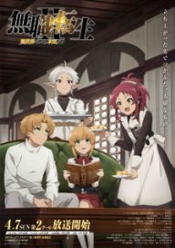
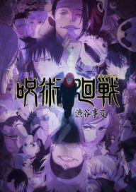
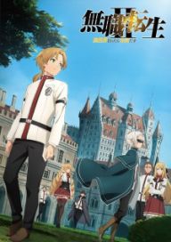
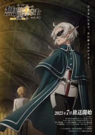
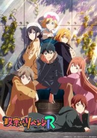
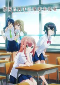
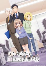
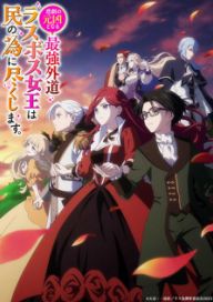
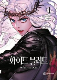
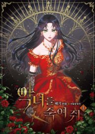
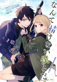
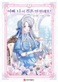
i got my arm back a couple days ago it hurts like hell though due to not being functional for 3 months. getting it back in normal state will be a nightmare, at least it's back now though, it'll be fine after a few weeks of exercise.
in the meantime i made this set in preparation for the halloween event i am hosting. it's like a conclusion of those nobunaga sets i was trying to make but just weren't working out. this set kinda has all the new stuff i learned like gradient maps, using perspective to create a 3D like effect and using blur to put emphasis on it. it's still not near the quality of set contests ones but it seems to be a step towards that:
i also finally made a furina signature! this one is not as effects heavy as the makima set but still works pretty well, i was inspired by the theatre vibe furina's trailer haha! pretty happy with how it turned out:
here's a nero set i made recently. this is a 500px set, i saw a couple of these and wanted to experiment with it since this render was much wider, this was the result:
pretty happy with it since i got to use different techniques that usual for these elements, had to cut that leaf crown from an artwork. i think i understand how sets work now.
yeah i've been resting more to healing it up, it'll just take some time. yup it'll hurt like hell but it's important. thanks! i hope so too.
that's true i'll have to look at signatures/other stuff and gather inspiration, though not being able to test right away has been a problem since i don't know if it would work or not. yup that's how my navia set was made, hopefully when i do eventually get to it i'll be able to find the right inspiration.
hmm i see, i'll find more layouts for inspiration then!
yeah figuring that out has been difficult since i don't know where to start haha! hopefully after gathering inspiration will give an idea. as for renders here's what i have currently:
oof yeah that would've been painful lol! glad that the pfp was safe!
yeah i do want to give sao a shot at some point but haven't gotten around to it yet. i've heard of the sao discourse over the years but i want to have my own opinion on it. yup i'll let you know my thoughts on sao when i get to it!
hmm i see! i am sold on it after reading fate level animation haha, i was looking for something to watch now that i've finally finished apothecary diaries (which was really good btw!) i might check sao next.
ohh interesting she looks like jeanne d'arc! will let you know my thoughts when i get to season 3.
oh nice! girls band cry is about a girl who kinda runs away from home and goes to tokyo to study, she meets her favorite singer who used to be in a band but had to quit, so stuff happened and they start a band. it's a very character focused emotional series. another cool thing about it is that it's in 3D and it looks surprisingly good!
ah cool! i've heard good things wistora and need to catch up on oshi no ko as well. have you seen makeine? i think you might like it since it's an unique romcom. i am watching elusive samurai, nier season 2, Shoushimin Series (my favorite one), Atri: My Dear Moments, spice and wolf remake and makeine.
sorry for the late reply, writing with the right hand takes a while.
yeah i am looking forward to season 2 since it'll cover the best part of the manhwa. it's definitely one of the series that they spent a lot of budget on, haven't seen sao but i'd imagine it's up there. yup it's definitely an enjoyable action series, i think solo leveling should've been 24 episodes but i guess they wanted to check if people were hyped for it or not.
yeah i'd recommend girls band cry, windbreaker and spice and wolf remake. these were pretty good! ah which seasonals are you watching, yup it's been really fun! yea i'll let you know what the next game will be!
that's true i can't try every style for it, i need to focus on one idea and overtime find something different through experiments rather than coming up with something new from scratch.
yeah it's a little confusing but i get what you mean, basically i need to find the main inspiration and only go for secondary one when something feels off which later can work as the secondary element or through experiments can become the main if it looks good. basically test and experiment as you build rather than coming up with it from nothing. that's what i understood.
btw my stitches gotten removed a couple days ago it's healing well. i got an actual plaster now, i'll have to go to the hospital a month and half to check it's progress, so i wouldn't be able to play or design for a while, the physical therapy after this will also take a while to get the hand working again.
yeah hopefully it'll heal soon so i can get back to work on it! yup i plan on watching/reading more now that i don't have much to do haha! recently finished the solo leveling anime which was alright, kinda sucks that it ends right before it gets to the good parts of the manhwa. other than that not sure but i'll probably catch up a bunch of stuff that i've been holding off on. ah nice! what anime do you plan on watching? ah it was a team effort between 2 people who i've been helping with making designs and me, base ideas and motivation are from them and overtime we plan everything then make the stuff that's needed for it so a lot of this wouldn't have been possible without them. i am kinda the mascot since according to them i have way more reach lol! i also make sure everything moves smoothly since we get distracted a lot haha, but yeah it's been fun! ah currently we are doing a team quiz game but the teams locked in now unfortunately, i'll let you know whenever we do another game! meanwhile you can check out the card game! it'll always continue and if it gets enough interaction maybe the 1.1 version will happen. yeah the has been great it's a small group of people that we know from forums who enjoy reading! ah thanks haha!
yeah the deadline was 3 days which was a double edged sword while it allowed me to not overthink and to commit to this set, i didn't have much time to test different things, it's both good and bad haha. ah i get what you mean time elements of the march banner aren't connected in a way that works with everything else and feels more thrown together than the one with a deadline. yeah maybe not overthinking the elements helped a lot. ah i'll have to learn photopea first before the i can do that lol!
yeah it's an idea that i had in mind for a while but i wasn't sure how to make an arlechinno set since elements for her will be difficult to come up with, but yeah i'll look into it after the layout.
yup having no limitations kinda makes it more difficult since it opens up a lot more options which can be pretty overwhelming. these 2 layouts were the style that i was going for:
i thought about going for just an element focused layout but i couldn't figure out how to execute that and what elements to use. that's true i'll try to look for another style that doesn't have centerpiece render and will post it here, i could also try your style of layout that you were going to use for oshi no ko but i don't know if the style would work for the render, i could try replicating the meteor shower scene in your layout's style as the first layer of the layout. that's true i should stick with one style since i am not exactly super familiar with either as well. yeah i'll post stuff here that might give some inspiration for this layout.
Hi yuki! happy to hear you've been well and you are back, it's been a while haha! ah i see, hopefully the balance between hectic and fun times is going well! yup try your best and don't burn out in the process haha. i hope the break was productive and fun for you! i had an accident a couple days ago (i'll DM you the details after this) basically i got a fractured left wrist and some stitches above my right eyebrow, so i can't design or do anything until it heals up so the layout is on hold for now. other than that i've been doing well, the past 3 months i helped a couple friends who were interested in learning editing and hosted a bunch of forum games like forum games olympics where made sets for the winners, we made a collectable anime trading card game though it wasn't super popular unfortunately and we are currently working on a team quiz/escape room game which has been fun, i also been a part of book club which has been really since i've been enjoying reading manga lately. that's about what i've been upto lately. there was also a popularity contest which i surprisingly won and got the title of king of FG lol!
glad to hear you liked the card! it was fun to make. ah i see, still i hope it was a fun day!
thank you! it's my favorite one i've made so far since it's probably the closest i've gotten to the style that most single banner set use, i was also under a 3 day time limit due to the tournament so to be able to finish it this quickly was really good. as for the fu xuan pfp, thanks! i mostly did the adjustments and got the color to pop more, the image was already really good that i didn't mess too much with the artwork.
ah i haven't used photopea since i got stuck on the power set, i thought about using it for the new projects but most of my ideas for navia and march sets were random ideas that popped into my head so i had to test it out before i forget, and since i was more familiar with pixlr i tested and made everything there. for photopea i'll have make stuff from scratch to be able to get used to it's system.
yeah finally i get a character early in genshin! though i still haven't had the motivation/time to continue it haha. yup i've learned a lot from them! it's not great to see them be interested in learning and using techniques to create their own unique style like using shadows under the double banner sets. it feels nice to see them get better overtime haha!
yeah i was really happy to be done with the yelan set, it took much longer than it needed to. ah no worries! i was able to find a way at the end which was good, as for the name it does bother me as well but i was also kinda checked out and ready to work on something else at that point so i finalized it there, though yeah experience from this set helped me a lot with navia and march set. i want to the next set to be an arlechinno one but planning that has been a nightmare haha, maybe after the layout i might get some ideas.
i think i've gotten a little better at absorption since the last time, though now i'll have to figure out how to use it for layouts which has like no limitations. this is about as far as i got before the accident, i am trying to make the top layer just focused on the render and the elements around her, though i was wondering if it's the right direction to go in since i am not sure if this render would work very well with the circle behind it (ignore the line background i am just using that as a reference, also the bottom of the render):
i want to keep the patterns there since it's good reference but i'll need to figure out a way to blend everything.
yeah i couldn't exactly figure out the direction for this layout so i was thinking of finding a middle ground where the top layer is art focused and everything else is designed focused.
Hey yuki! how have you been? i hope everything's been well! this is probably the longest break you've had from mal haha, i hope it's been fun!
i made a new forum set recently! it's very different from my usual designs and i think might be my best work yet. i made this for a forum set tournament that happening in forum games right now, even soniyay and saintzeph praised it which was very surprising since i've been inspired by their works before so it feels surreal to be acknowledged haha!
i am going to be starting frieren layout soon, i think i've delayed it for too long and i wouldn't know if i've gotten any better if i don't make a layout. i don't have anything planned haha! will have to figure it out soon.
i made a new forum set yesterday! this took me like 4-5 hours but i am quite happy with how it turned out, thankfully didn't get stuck on something this time like i did with yelan banner haha! am i improving at this? i did take inspiration for another set and made this but i don't know if i've good enough to handle the frieren layout.
Happy Birthday yuki! i hope you have an incredible day!
i tried to do something different with the card this time by using the masked mode on a lightning background, and added some stuff to the text.
anyways how have you been? i hope everything's going well!
i was having some laptop issues so wasn't able to do much designing lately, though i've been trying to learn photopea it's kinda overwhelming but it's definitely worth the trouble since it allows a lot more things than pixlr. currently i have a power forum set in the works but i've been blanking on what elements to use so it's kinda stuck, i wonder when i'll be able to see what would work for every set just like i saw for the yelan one, here's what it looks like currently:
though i just won my first 50/50 in genshin after playing for 2 years lol! so i am very interested in creating a set with clorinde.
other than that in july i'll be helping a mal friend understand the basics to how to create a forum set since they seem really interested in learning it, i am also helping them create a collectable card game for the forums which has been fun. that's about everything i've been upto recently.
but yeah happy birthday once again! i hope you aren't burning yourself out, remember to take a break every once in a while! all the best with everything!
Hi! how have you been? i hope everything's going well!
i made some slight changes to the banner, i went with a different font for both text since the first one made my name even longer haha! also i made duplicates of the threads and used screen mode on those layers, i am thinking of removing my name it's not working here. after what should should i change? it still feels off or am overthinking it?
yeah for this one i might need to find the best placement and blending options for it since it really stands out right now:
also i tested to see how the background would look with all the sun burst effects that i added yesterday, here's what it looks like:
oh that's interesting! i'll try that, here's how the text would look like, the yelan text works it's just my name that feels out of place, maybe with different fonts it might work better:
as for the circle i am a bit confused, did you mean the circle itself or it's outline? i could try doing that to the circle but the abstract triangles would just make it very bright with the mask mode that you won't be able to see the details, like here's the mask normally
and here's one with overlay/screen mode
. as for the outline here's the result, it doesn't really help much:
yeah i used 3 layers i think that might've been a bit much, here's one with text underneath and i made the text blue this time just to see how it'll look(this has 5 layers) :
and here's one in white (this has 4)
hmm did you mean something like this? i cut and edited a galaxy background:
hmm water effect is a good idea but i am not sure how would that look like for the text, maybe floating bubbles around the text or the text itself would have bubbles?
hmm that's true i didn't think of that, since most banners that i was trying to element inspiration from utilized space and background really well which kinda made me question if my approach was right or not, but yeah it depends on the placement and layering whether it'll work or not. btw your new pfp looks great! glad to see you liked season 2 of dangers of the heart as well.
i am running into a problem with the gradient circle it's not changing the the white areas for some reason, i've tried adjustments, gradient map, darken etc but nothing seems to be working, like i tried to darken it but nothing happened:
did you mean something like this for the placement? (the text is placeholder i'll make a better one later once the position is down):
All Comments (1099) Comments
i got my arm back a couple days ago it hurts like hell though due to not being functional for 3 months. getting it back in normal state will be a nightmare, at least it's back now though, it'll be fine after a few weeks of exercise.
in the meantime i made this set in preparation for the halloween event i am hosting. it's like a conclusion of those nobunaga sets i was trying to make but just weren't working out. this set kinda has all the new stuff i learned like gradient maps, using perspective to create a 3D like effect and using blur to put emphasis on it. it's still not near the quality of set contests ones but it seems to be a step towards that:
i also finally made a furina signature! this one is not as effects heavy as the makima set but still works pretty well, i was inspired by the theatre vibe furina's trailer haha! pretty happy with how it turned out:
here's a nero set i made recently. this is a 500px set, i saw a couple of these and wanted to experiment with it since this render was much wider, this was the result:
pretty happy with it since i got to use different techniques that usual for these elements, had to cut that leaf crown from an artwork. i think i understand how sets work now.
that's true i'll have to look at signatures/other stuff and gather inspiration, though not being able to test right away has been a problem since i don't know if it would work or not. yup that's how my navia set was made, hopefully when i do eventually get to it i'll be able to find the right inspiration.
hmm i see, i'll find more layouts for inspiration then!
yeah figuring that out has been difficult since i don't know where to start haha! hopefully after gathering inspiration will give an idea. as for renders here's what i have currently:
oof yeah that would've been painful lol! glad that the pfp was safe!
hmm i see! i am sold on it after reading fate level animation haha, i was looking for something to watch now that i've finally finished apothecary diaries (which was really good btw!) i might check sao next.
ohh interesting she looks like jeanne d'arc! will let you know my thoughts when i get to season 3.
oh nice! girls band cry is about a girl who kinda runs away from home and goes to tokyo to study, she meets her favorite singer who used to be in a band but had to quit, so stuff happened and they start a band. it's a very character focused emotional series. another cool thing about it is that it's in 3D and it looks surprisingly good!
ah cool! i've heard good things wistora and need to catch up on oshi no ko as well. have you seen makeine? i think you might like it since it's an unique romcom. i am watching elusive samurai, nier season 2, Shoushimin Series (my favorite one), Atri: My Dear Moments, spice and wolf remake and makeine.
sorry for the late reply, writing with the right hand takes a while.
yeah i'd recommend girls band cry, windbreaker and spice and wolf remake. these were pretty good! ah which seasonals are you watching, yup it's been really fun! yea i'll let you know what the next game will be!
that's true i can't try every style for it, i need to focus on one idea and overtime find something different through experiments rather than coming up with something new from scratch.
yeah it's a little confusing but i get what you mean, basically i need to find the main inspiration and only go for secondary one when something feels off which later can work as the secondary element or through experiments can become the main if it looks good. basically test and experiment as you build rather than coming up with it from nothing. that's what i understood.
btw my stitches gotten removed a couple days ago it's healing well. i got an actual plaster now, i'll have to go to the hospital a month and half to check it's progress, so i wouldn't be able to play or design for a while, the physical therapy after this will also take a while to get the hand working again.
yeah the deadline was 3 days which was a double edged sword while it allowed me to not overthink and to commit to this set, i didn't have much time to test different things, it's both good and bad haha. ah i get what you mean time elements of the march banner aren't connected in a way that works with everything else and feels more thrown together than the one with a deadline. yeah maybe not overthinking the elements helped a lot. ah i'll have to learn photopea first before the i can do that lol!
yeah it's an idea that i had in mind for a while but i wasn't sure how to make an arlechinno set since elements for her will be difficult to come up with, but yeah i'll look into it after the layout.
yup having no limitations kinda makes it more difficult since it opens up a lot more options which can be pretty overwhelming. these 2 layouts were the style that i was going for:
btw your new pfp looks great!
glad to hear you liked the card! it was fun to make. ah i see, still i hope it was a fun day!
thank you! it's my favorite one i've made so far since it's probably the closest i've gotten to the style that most single banner set use, i was also under a 3 day time limit due to the tournament so to be able to finish it this quickly was really good. as for the fu xuan pfp, thanks! i mostly did the adjustments and got the color to pop more, the image was already really good that i didn't mess too much with the artwork.
ah i haven't used photopea since i got stuck on the power set, i thought about using it for the new projects but most of my ideas for navia and march sets were random ideas that popped into my head so i had to test it out before i forget, and since i was more familiar with pixlr i tested and made everything there. for photopea i'll have make stuff from scratch to be able to get used to it's system.
yeah finally i get a character early in genshin! though i still haven't had the motivation/time to continue it haha. yup i've learned a lot from them! it's not great to see them be interested in learning and using techniques to create their own unique style like using shadows under the double banner sets. it feels nice to see them get better overtime haha!
yeah i was really happy to be done with the yelan set, it took much longer than it needed to. ah no worries! i was able to find a way at the end which was good, as for the name it does bother me as well but i was also kinda checked out and ready to work on something else at that point so i finalized it there, though yeah experience from this set helped me a lot with navia and march set. i want to the next set to be an arlechinno one but planning that has been a nightmare haha, maybe after the layout i might get some ideas.
i think i've gotten a little better at absorption since the last time, though now i'll have to figure out how to use it for layouts which has like no limitations. this is about as far as i got before the accident, i am trying to make the top layer just focused on the render and the elements around her, though i was wondering if it's the right direction to go in since i am not sure if this render would work very well with the circle behind it (ignore the line background i am just using that as a reference, also the bottom of the render):
i want to keep the patterns there since it's good reference but i'll need to figure out a way to blend everything.
yeah i couldn't exactly figure out the direction for this layout so i was thinking of finding a middle ground where the top layer is art focused and everything else is designed focused.
i made a new forum set recently! it's very different from my usual designs and i think might be my best work yet. i made this for a forum set tournament that happening in forum games right now, even soniyay and saintzeph praised it which was very surprising since i've been inspired by their works before so it feels surreal to be acknowledged haha!
i am going to be starting frieren layout soon, i think i've delayed it for too long and i wouldn't know if i've gotten any better if i don't make a layout. i don't have anything planned haha! will have to figure it out soon.
i made a new forum set yesterday! this took me like 4-5 hours but i am quite happy with how it turned out, thankfully didn't get stuck on something this time like i did with yelan banner haha! am i improving at this? i did take inspiration for another set and made this but i don't know if i've good enough to handle the frieren layout.
i tried to do something different with the card this time by using the masked mode on a lightning background, and added some stuff to the text.
anyways how have you been? i hope everything's going well!
i was having some laptop issues so wasn't able to do much designing lately, though i've been trying to learn photopea it's kinda overwhelming but it's definitely worth the trouble since it allows a lot more things than pixlr. currently i have a power forum set in the works but i've been blanking on what elements to use so it's kinda stuck, i wonder when i'll be able to see what would work for every set just like i saw for the yelan one, here's what it looks like currently:
though i just won my first 50/50 in genshin after playing for 2 years lol! so i am very interested in creating a set with clorinde.
other than that in july i'll be helping a mal friend understand the basics to how to create a forum set since they seem really interested in learning it, i am also helping them create a collectable card game for the forums which has been fun. that's about everything i've been upto recently.
but yeah happy birthday once again! i hope you aren't burning yourself out, remember to take a break every once in a while! all the best with everything!
i made some slight changes to the banner, i went with a different font for both text since the first one made my name even longer haha! also i made duplicates of the threads and used screen mode on those layers, i am thinking of removing my name it's not working here. after what should should i change? it still feels off or am overthinking it?
Have a wonderful day 💖
also i tested to see how the background would look with all the sun burst effects that i added yesterday, here's what it looks like:
oh that's interesting! i'll try that, here's how the text would look like, the yelan text works it's just my name that feels out of place, maybe with different fonts it might work better:
as for the circle i am a bit confused, did you mean the circle itself or it's outline? i could try doing that to the circle but the abstract triangles would just make it very bright with the mask mode that you won't be able to see the details, like here's the mask normally
yeah i used 3 layers i think that might've been a bit much, here's one with text underneath and i made the text blue this time just to see how it'll look(this has 5 layers) :
hmm did you mean something like this? i cut and edited a galaxy background:
hmm water effect is a good idea but i am not sure how would that look like for the text, maybe floating bubbles around the text or the text itself would have bubbles?
hmm that's true i didn't think of that, since most banners that i was trying to element inspiration from utilized space and background really well which kinda made me question if my approach was right or not, but yeah it depends on the placement and layering whether it'll work or not. btw your new pfp looks great! glad to see you liked season 2 of dangers of the heart as well.
did you mean something like this for the placement? (the text is placeholder i'll make a better one later once the position is down):