Dec 17, 2017
(Check out my profile for a link to my site containing more up-to-date reviews and bonus media!)
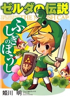
Unsurprisingly, one of the weaker Zelda worlds results in one of the weaker Zelda manga. The Wind Waker's retro cartoonish visual style may sound like an ideal fit for a manga, but ironically it ends up ensuring this manga has nothing substantial to add to its game. Manga adaptations of Ocarina of Time and Majora's Mask were the story's first opportunities to tell themselves using the more mature and detailed tone of the official art that was excluded by the Nintendo 64's limited capabilities. Those manga enrich the experience,
...
while this aesthetic which relies heavily on actual animation and moving expressions suffers in manga format.
Furthermore, needing to render graphics for a game and what you can realistically portray in a still 2D image are concepts that can be extremely far apart, and certain Zeldas are as distant from these as possible. The basic style of the Wind Waker-esque games aims to transmit the simplicity of a flat art style in a world with depth. There's a great disparity when it comes to technical issues such as quality of cel-shading, but at its basic needs Wind Waker's character designs don't require a ton of effort to convey. The quality of that conveyance can very greatly, but the original character design itself is barely altered by any transition, as seen by the few differences between the same Wind Waker and Minish Cap NPCs despite them being in entirely different graphic styles. It's a style not as limited as more traditional games like Ocarina of Time, whose more realistic basic art style pushes the demands of the games to a goal that wasn't reachable in the first place. Bringing out that realism on a 2D image is much less demanding than rendering all that detail in a 3D game. Thus, Ocarina of Time in manga format can realistically be expected to actually be a more accurate rendition of the game's original concept designs, while a manga like Minish Cap is replicating something that was already achieved and far less compromised. The Minish Cap adaptation only had something to lose when it came to aesthetic, while Ocarina of Time, Majora's Mask, etc., had everything to gain.
The original content added to the Minish Cap manga in order to bridge events or move things along faster all fits in well and usually its versions of events have a bit more gravitas to them. Back stories of death, tragedy, and such things. Nothing inappropriate for a kids' fairy tale, though. Contrivances needed to shove the plot along can be forgiven by the author's presumably imposed number of chapters. Himekawa's vastly diverse art styles continues to amaze, and she adapts Minish Cap every bit as well as she has previous Zelda worlds. Ezlo in particular is much more appealing in the manga than he is in the game, aided by a bevy of endearingly pitiful expressions. One issue I found irritating is that it's often difficult to tell whether Link or Ezlo is talking in a panel, as several word balloons don't have arrows and Ezlo has his mouth open in nearly every panel by his default pose.
As usual, this feels like a genuine work of passion rather than an advertisement for the Zelda game it adapts. It only ever appears to advocate the appeal of the game when Link is showing awe at the many fantastical locations or having joy playing with the game's numerous items, but those are still natural responses and acknowledgement to mechanics necessary to properly adapt the game's story. Again, this is another well-done Zelda manga, mostly limited by the source material. Minish Cap's tone and aesthetic ensured its world was better realized by a moving medium, whereas other games in the series have some more potential drawn out of them. The Minish Cap manga ends up feeling redundant by comparison, and the few bits where it builds on the game's narrative are spread out and slight. Even for hardcore Minish Cap fans there might not be much to get too excited about here. This is almost entirely the world of Minish Cap as you know it, just with less luster.
Reviewer’s Rating: 5
What did you think of this review?
Nice
 0
0
Love it
 0
0
Funny
 0
0
Confusing
 0
0
Well-written
 0
0
Creative
 0
0Show all

