Lines are present pretty much everywhere. So, it's no surprise they have an important role in character design. But first, I'll present some line qualities and each of their meanings. Then, we'll see some applications of it.
Thin lines: Fragile and powerless, they also suggest delicacy and lightness. Also mean elegance.
Thick lines: Those are powerful, strong and suggest weight. In character design, those are usually used in places you want to emphasize or in heavy places. Like, for example, lines that contour a character's feet are often thicker than in the rest of the body, since the weight of the character is put in their feet.
Horizontal lines: Quiet, relaxed and comfortable, they also mean stability and security. They can also be used to accentuate width.
Vertical lines: They mean power and energy, strength and rigidness. Also mean stability when they are thick. Those are also used to accentuate height and to suggest lack of movement.
Diagonal lines: Unbalance, energy, dynamism, action, motion, etc. Those are more dramatic and create tension and excitement. When they rest against a vertical line, they mean something solid and unmoving, though.
Curved lines: They express a fluid movement and unpredictability. Those mean something calm and gentle when they curve slowly, but can mean dynamism when the curve is faster.
Zig zag lines: Those lines have the dynamic and energetic feel of diagonal lines, but also convey confusion and nervousness because of their constant and quick change of direction. Also mean danger and destruction.
Artificial lines: Those are perfectly straight lines, something that is not found in nature. Thus, they mean something artificial, created by man.
Natural lines: Opposite of artificial lines, those are full of curves, even if those are small, and mean something more natural and complex.
Sharp end lines: Convey aggressiveness and uneasiness.
Now, a tip. Repeating the same kind of line quality(specially thickness) in a design must be avoided. This creates something bland and dull. Differences in line qualities give much more life to the design. For example:
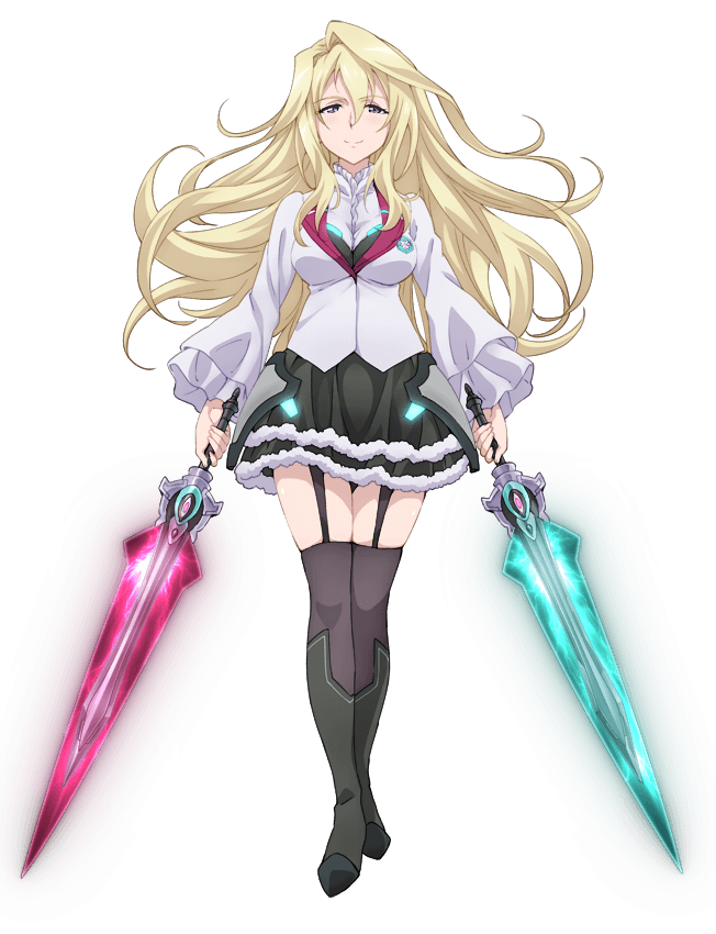 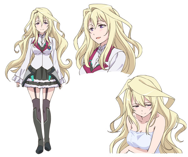
Look at the first picture. Notice how it has much more life than the second picture of Claudia's full body. There are other reasons for this, but one of them is the difference in line thickness present in the first picture. The second picture has pretty much the same line thickness around the whole body. Now, look at the first one. Notice how the lines of her chin and under her chest are a little thicker than in her clothes and hair, as those are more important areas for the design. Also the line is a lot thicker around her socks and feet to suggest weight. Something else that can be noted is that, in the first picture, the lines of her hair have softer and less abrupt curves than in the second picture. This makes her hair look a lot lighter in the first picture.
Now how lines are used to convey different things about a character? Let's see another example:
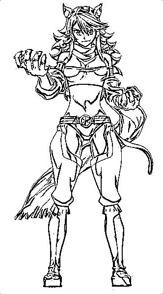
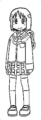
Those are two girls from different animes. The first one is from a gory dark one, and the second one from a light slice-of-life.
Compare the two images. The first one has much more complex lines. Not only it has more lines, but they are also full of frequent curves, which are more natural. This makes the design closer to reality. No, i'm not saying the design is realistic, but it's much more realistic than the second one.
The second one has less and simpler lines. Simplicity is a resource used to get cuteness. Notice how the design is composed mostly of straight lines, and when it's not a straight line, it's a calm curved line, with slow curves. But the brilliance of this design isn't this. This girl is a robot. This fits perfectly with the straight lines of her design, because straight lines mean something artificial. Now, one thing the design got wrong is the presence of the vertical lines, and the zig zag of her hair. When I first saw her, I thought she was an energetic and outgoing girl, because those lines mean that. However, she's actually a shy and introvert girl. The design could be a lot better if it tried to use more horizontal lines, instead of verticals, and deleted that zig zag.
Next time I'll talk about shapes. ;)
|


