New
Apr 24, 2011 2:46 PM
#1

You can post your cards here and get feedback and help from veteran card makers and from other rookies pls put your cards under a spoiler button |
xRay-chanxApr 24, 2011 3:05 PM
Apr 26, 2011 10:32 AM
#2

| Cool ^^ Rate my cards, please! You can say: "Your cards look like shit". You can speak German, English or French. Here are my cards: 1 // 2 // 3    |
Apr 26, 2011 12:49 PM
#3

Here's my one and only card. I'm still inexperienced at this stuff so its just a hue and saturation change. I had to trace around every detail to do it, very slow. I don't have any borders around it. |
| Signature removed. Please follow the signature rules, as defined in the Site & Forum Guidelines. |
Apr 26, 2011 1:22 PM
#4
| wow your card looks good, so you changed the saturation and hue to make len red and rin blue? that sounds like much work^^ the idea is good, but for the start i would use the picture as it is (that's not so much work xD) i think it's hard enough to try out which colors and fonts fit to a picture (well my biggest problem was choosing a color :3) and if you have to make a few more cards for an le it would take really a long time to always edit the picture^^ but i would add a border, it looks more like a card then, but i think that depends on taste |
Apr 26, 2011 2:01 PM
#5
| Thax for Ray, it makes me feel better about the card and about borders, i dont know how to do that on the software i use |
| Signature removed. Please follow the signature rules, as defined in the Site & Forum Guidelines. |
Apr 26, 2011 2:07 PM
#6
| i'm sorry i can't help you with the border since it is my problem as well, my border is always just a plain line xD |
Apr 26, 2011 4:25 PM
#7

| A plain line works too sometimes. You just need something to outline the picture. Or another thing I do to make then look nicer is have a white border and then have another color or black border around that. this way it's simple but looks complicated or nicer I guess. |
 |
Apr 27, 2011 5:01 AM
#8


Apr 27, 2011 5:09 AM
#9

My bunch:                            |
shadowswordApr 27, 2011 5:13 AM

Apr 27, 2011 7:50 AM
#10

| mine, is it alright if it's a link?, oh well tell me if there any wrong with my cards |
 |
Apr 27, 2011 2:46 PM
#11
| @ black-alice: i don't know where i can give you tipps, you have a nice border, you chose a fitting font and the color matches as well. nice^^ @ shadowsword: it's interesting that every card has it's own style, but i would have made the text a little bit bigger on some cards it's hard to read i like the last 7 cards the most: they look simple, but they aren't, everything is in harmony @ cookies05: your cards have an innovative design and look nice ( are you really a rookie ? XD i already requested a bunch of cards from you) sometimes the color of the text doesn't fit perfectly, but i think that depends on taste and maybe you chose that colors on purpose i hope what i wrote makes sense xD |
Apr 27, 2011 3:37 PM
#12
| Nekro-Nin,your cards are shit.An damn amazing shit >< Come to my club,LCS,you find it in my profile.Whit that design,if you apply for cardmaker you're more than hired! shadowsword,make your cards smaller,in rest they all look great. black-alice,I'd hire you too! as an cardmaker,the card looks very cool. cookies05,please let me hire you as an cardmaker in LCS....T^T that cards were awesome. |
 |
Apr 27, 2011 4:16 PM
#13
| I post it up my card here if I knew how to make one xD I try to make one but I'm really a newbie in Photoshop |
Apr 27, 2011 4:28 PM
#14
| well a step by step walkthrough will be made soon^^ if you have general questions you can post them here (for example: what do i have to do first?) and if you're really a newbie you should maybe use an easier program first or you have to fight your way through photoshop xD |
Apr 27, 2011 5:05 PM
#15
xRay-chanx said: well a step by step walkthrough will be made soon^^ if you have general questions you can post them here (for example: what do i have to do first?) and if you're really a newbie you should maybe use an easier program first or you have to fight your way through photoshop xD in relation to make cards I'm really newbie, I have photoshop here for a long time but I only used to translate mangas or something related, for the rest I don't know nothing xD a Photoshop tutorial would be great, has a tutorial from Nekro-Nin, but is for GIMP :X |
Apr 27, 2011 5:18 PM
#16

| if you want I can help you :3 I'm also a photoshop user (though not an expert with the software) but I can help you out with the basics :D it's okay if you don't want to... |
 |
Apr 27, 2011 6:21 PM
#17
xyBer_ said: if you want I can help you :3 I'm also a photoshop user (though not an expert with the software) but I can help you out with the basics :D it's okay if you don't want to... no problem, i want xD the only thing that I know is resize the picture, after that I don't know where to go, put a cool font, effects and other things ò_ó |
Apr 27, 2011 6:59 PM
#18
Dark_LP said: no problem, i want xD the only thing that I know is resize the picture, after that I don't know where to go, put a cool font, effects and other things ò_ó I'd say what you can do next is to crop the picture with the desired shape or size that you want, you can either use the rectangular marquee tool or rounded rectangle tool..maybe you can try it first with the rectangular marquee tool then we'll go with the rounded one later... okay, first click the rectangular marquee tool icon then draw a box or rectangle around the area of the picture that you want to keep then go to Image>Crop.. after that you can either choose to put a border or not though I'd recommend to put one, looks better that way :P..you can do this in two ways... 1) in the layers palette, click the 'fx' icon at the bottom>stroke..a drop box will appear..and for the size, I'd either put between 1-3; position: inside; just leave the blend mode, opacity and fill type as it is (you can experiment on those later on :p); you can choose any color you want>OK.. 2) create a new layer, with the new layer highlighted on the layers palette, point your cursor on the image (also on the layers palette) then press CTRL+left click..this should load the selection or (you can also do it by highlighting the image on the layers palette..then Select> load selection..then highlight the new layer), then click Edit>stroke..then put the settings that you want.. so that's it..you now have a border! :D how about we use this as an example  then for the text..let's see how about putting 'Member Cards for Rookies..then just make up any LE names...then your name for the fonts..there are a lot of sites where you can download free ones...like dafont.com as for the effects, maybe you can show me a card with effects then I'll see if I can help you how it was done... =D so tell me how it goes after your done.. |
incarnateApr 27, 2011 7:32 PM
|
Apr 27, 2011 7:52 PM
#19
xRay-chanx said: @ black-alice: i don't know where i can give you tipps, you have a nice border, you chose a fitting font and the color matches as well. nice^^ @ shadowsword: it's interesting that every card has it's own style, but i would have made the text a little bit bigger on some cards it's hard to read i like the last 7 cards the most: they look simple, but they aren't, everything is in harmony @ cookies05: your cards have an innovative design and look nice ( are you really a rookie ? XD i already requested a bunch of cards from you) sometimes the color of the text doesn't fit perfectly, but i think that depends on taste and maybe you chose that colors on purpose i hope what i wrote makes sense xD well, you're right, i choose a different color for the text, so the cards color didn't look dead, that's why, anyway, sometimes i didn't get any idea for cards, in that way, i''ll going to many cards club to help me decide cards shape, lol~ and for musician, thx |
|
Apr 27, 2011 8:21 PM
#20
Musician_Soul98 said: Nekro-Nin,your cards are shit.An damn amazing shit >< Come to my club,LCS,you find it in my profile.Whit that design,if you apply for cardmaker you're more than hired! shadowsword,make your cards smaller,in rest they all look great. black-alice,I'd hire you too! as an cardmaker,the card looks very cool. cookies05,please let me hire you as an cardmaker in LCS....T^T that cards were awesome. OMG, really!?. Thanks Musician! :33 |
     |
Apr 27, 2011 8:38 PM
#21

| Umm.. this is the first card I've ever made... please comment ^^ (I don't know how to do the spoiler thingie.. =.=) http://sheepymusyrooms.deviantart.com/art/Card-206695664 |
Apr 27, 2011 9:27 PM
#22
xyBer_ said: Dark_LP said: no problem, i want xD the only thing that I know is resize the picture, after that I don't know where to go, put a cool font, effects and other things ò_ó I'd say what you can do next is to crop the picture with the desired shape or size that you want, you can either use the rectangular marquee tool or rounded rectangle tool..maybe you can try it first with the rectangular marquee tool then we'll go with the rounded one later... okay, first click the rectangular marquee tool icon then draw a box or rectangle around the area of the picture that you want to keep then go to Image>Crop.. after that you can either choose to put a border or not though I'd recommend to put one, looks better that way :P..you can do this in two ways... 1) in the layers palette, click the 'fx' icon at the bottom>stroke..a drop box will appear..and for the size, I'd either put between 1-3; position: inside; just leave the blend mode, opacity and fill type as it is (you can experiment on those later on :p); you can choose any color you want>OK.. 2) create a new layer, with the new layer highlighted on the layers palette, point your cursor on the image (also on the layers palette) then press CTRL+left click..this should load the selection or (you can also do it by highlighting the image on the layers palette..then Select> load selection..then highlight the new layer), then click Edit>stroke..then put the settings that you want.. so that's it..you now have a border! :D how about we use this as an example then for the text..let's see how about putting 'Member Cards for Rookies..then just make up any LE names...then your name for the fonts..there are a lot of sites where you can download free ones...like dafont.com as for the effects, maybe you can show me a card with effects then I'll see if I can help you how it was done... =D so tell me how it goes after your done.. well, thank you very much ^^ I followed your tips and managed to make a simple card here : 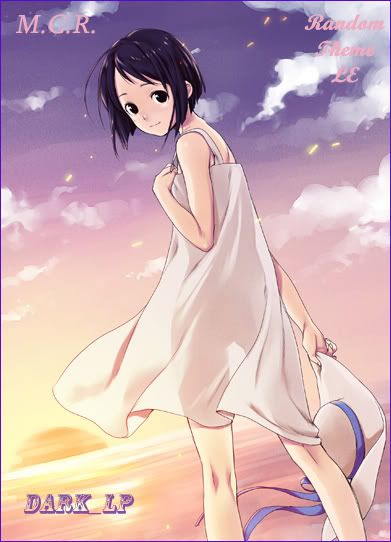 was very large but okay I think it would look better if put a background of another color in the letters, as this card:  so M.C.R. , name and the rest would be more visible or to give one more 'charm' to the card :P know how to put it there? :) |
TheInsaneApr 27, 2011 9:31 PM
Apr 27, 2011 9:36 PM
#23
Dark_LP said: so M.C.R. , name and the rest would be more visible or to give one more 'charm' to the card :P know how to put it there? :) Use Selection Tool. How to do it>> Click the selection tool and select the part you want:  And then Right Click>>Fill You can set the opacity for transparency :) |
-arisu-Apr 27, 2011 9:42 PM
|
Apr 27, 2011 9:56 PM
#24
black-ALICE said: Dark_LP said: so M.C.R. , name and the rest would be more visible or to give one more 'charm' to the card :P know how to put it there? :) Use Selection Tool. How to do it>> Click the selection tool and select the part you want: And then Right Click>>Fill You can set the opacity for transparency :) Yaa i did it, thanks too :) , it was quite simple after all tips, I'll see if I can make some nice cards :P |
Apr 28, 2011 4:30 AM
#25
| @ Dark_LP: for your first card it looks very good :3 i would only change two things you already mentioned yourself: the size and the text the size: if a card looks like a card depends much on the size and an oblong card will always look more like a card than a quadratic one (that's because humans are used to this shape, bank cards etc have that shape as well) is the card too big it looks like some pic with text on it, but if you make a smaller one (about the size of a bank card for example) everyone will recognize it as a card ( i made this mistake in the beginning as well, my cards are too big (like official cards and welcome cards) the 50+ le card has the size i use now (350 x 200 px) and looks better, well that's my opinion^^ the text: color and font are matching the picture, but you are right it's hardly visible there are two options now: putting something under the text (like in the welcome le) or you border the text i'm afraid i can't tell you how that works with photoshop because i don't use it, maybe someone else can explain that @kitty132383: good card for your first time^^ of course it doesn't look perfect yet but you should have seen my first card *shudder* the size: for you applies the same that i already told dark_lp, a little bit smaller and maybe more oblong the text: i would use a softer font for this picture, since the colors are very light and there aren't any hard edges and i would chose a color from the picture as text color (maybe the dark purple of the bow) because black doesn't match the other colors very well of course i'm not an expert myself, but the tipps i gave you are based on my own experience^^ i hope they're helpful |
Apr 28, 2011 6:03 AM
#26
| oh yes for all, i'd like to ask one question, i often see picture with border like this, how do i make it?  |
|
Apr 28, 2011 7:13 AM
#27

xRay-chanx said: there are two options now: putting something under the text (like in the welcome le) or you border the text i'm afraid i can't tell you how that works with photoshop because i don't use it, maybe someone else can explain that In photosop, where youhave the layers, you have to double-click on the blank part of the layer 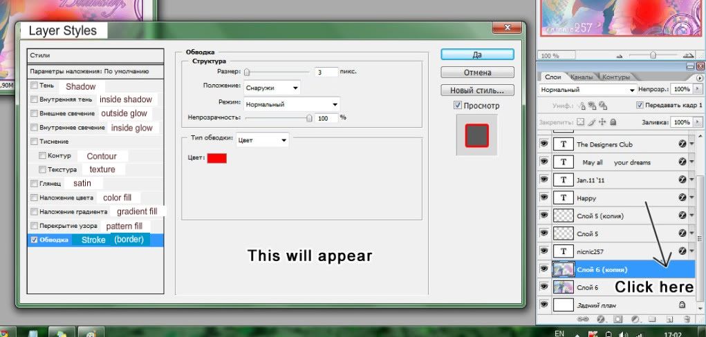 it gives a lot of new stuff youcan play around (if you have time) to chage for the whole layer. the last option on the left (stroke) is to make a border. you canchoose the color and thicknes. (I'd reccomend not to make it very thick tho - 1 pixel should be enough) you can also add a shadow, or a glow (for dark backgrounds) (I'm sorry my photoshop is in russian, I tried translating as best I could) also that's how you can add a border to pretty much anything, as long as it's on it's own layer. tick the "prieview" box too, it will make it much eisier to make sure the color and thickness is right. if you want to add a border to the card itself you can add a border to the layer with the main picture and change the position to "inside" |
RulenneClarissaApr 28, 2011 7:20 AM
  |
Apr 28, 2011 8:10 AM
#28
cookies05 said: oh yes for all, i'd like to ask one question, i often see picture with border like this, how do i make it? Ah, you mean a dashed/dotted border? If that's the case, maybe I can help you. I hope it's understandable >.< Here (I rarely use dashed border, so I'll explain how to make dotted border)>> First, select all of the image using selection tool. And then Right Click>>Stroke:  Set to 5px and white colored. So here's the result:  Second, click the brush tool, and choose brush with 2px size. After that, press F5 on your keyboard, and brush window popping up, and it should be like this:  Then, click Brush Tip Shape  And set the spacing to 180%  Third step, drag the brush around the corner of image AND HOLD SHIFT WHILE DO IT. IT'S IMPORTANT. WITHOUT HOLDING SHIFT:  HOLDING SHIFT:  I hope it'll help you :)) |
|
Apr 28, 2011 11:15 AM
#29

 and these ones i made to get some experience:   i've been using gimp for some time but i'm still a beginner. i wanted to ask about that 'button' effect, like this one:  the edges are nicely blurred but the picture's quality has been damaged (i've made it in !microsoft word! ;p). is it possible to make such an effect in gimp? i know there's an option 'add bevel' but it doesn't look that good. also, are there any shapes available beyond rounded edges (sth like my last card)? (if not in gimp, do you know any other freeware software?). i also wanted to ask how to make that effect... hm... as if a picture were behind some glass... if you understand what i mean ;| hope someone could help me |

Apr 28, 2011 6:33 PM
#30
black-ALICE said: cookies05 said: oh yes for all, i'd like to ask one question, i often see picture with border like this, how do i make it? Ah, you mean a dashed/dotted border? If that's the case, maybe I can help you. I hope it's understandable >.< Here (I rarely use dashed border, so I'll explain how to make dotted border)>> First, select all of the image using selection tool. And then Right Click>>Stroke: Set to 5px and white colored. So here's the result: Second, click the brush tool, and choose brush with 2px size. After that, press F5 on your keyboard, and brush window popping up, and it should be like this: Then, click Brush Tip Shape And set the spacing to 180% Third step, drag the brush around the corner of image AND HOLD SHIFT WHILE DO IT. IT'S IMPORTANT. WITHOUT HOLDING SHIFT: HOLDING SHIFT: I hope it'll help you :)) thank you very much for the help ^^ |
|
Apr 28, 2011 7:43 PM
#31
| hello everyone o Thanks for the tips of all, I've been practicing doing some cards, I think it does not evolve almost nothing, but it's just to register my work here ^^  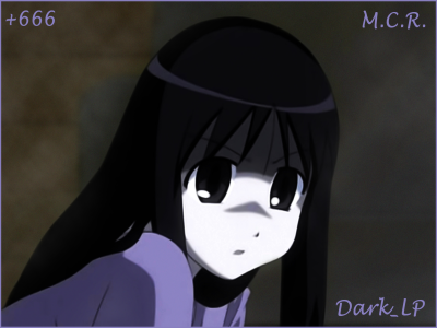 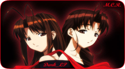 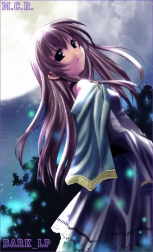 I still think my cards are big, when I turn it down to size, they are all distorted I have a lot to improve yet, but I will not quit :D |
Apr 28, 2011 9:34 PM
#32
neco said: also, are there any shapes available beyond rounded edges (sth like my last card)? (if not in gimp, do you know any other freeware software?). i also wanted to ask how to make that effect... hm... as if a picture were behind some glass... if you understand what i mean ;| hope someone could help me I made a tutorial here on how to make a card with semi-rounded edges though I used photoshop to make it..if you want to try this software, there's a 30-day free trial at adobe.com/downloads :3 Dark_LP said: hello everyone o Thanks for the tips of all, I've been practicing doing some cards, I think it does not evolve almost nothing, but it's just to register my work here ^^ I still think my cards are big, when I turn it down to size, they are all distorted I have a lot to improve yet, but I will not quit :D you should first resize them, then crop the part that you want... because resizing them after you've added borders, texts, patterns and other effects will surely make them look distorted especially on rounded cards ^^ how about something similar to this size or you can make it a little bit bigger than this  also I suggest that if the background is just one color/plain (in rectangular shaped cards because I think it's looks okay on rounded ones), you can crop it a little bit more so the focus is on the character (something like the focal point of the card?) and so that there aren't much blank areas..though it really depends on the card maker :P  these are just based on my experience and btw, you've quite improved ;D gambatte! oh, you mentioned on your previous post that you translate manga, what scanlation group are you part of? :3 |
incarnateApr 29, 2011 6:34 AM
|
Apr 29, 2011 4:50 AM
#33

| Here are my cards , hope they`re ok o.O Feedbacks are very welcome ^_^  -  And minna , can you join here ? [http://myanimelist.net/clubs.php?cid=26285] Thanks !! + I`ll add more cards , if I have more time . LOL xDD Of course I`ll do different styles and such by time to time . |
HengaoApr 29, 2011 4:54 AM
Apr 29, 2011 6:34 AM
#34
| New card's coming~! :3 Feedback please (I don't think this card's good enough xd)  I'm addicted to Matryoshka since yesterday, so I decided to make a Matryoshka-themed card. Listened to it while working on this card~ ^3^ I just removed the BG and added the text (that's Matryoshka's lyric) More cards to come! :3 |
-arisu-Apr 29, 2011 6:37 AM
|
Apr 29, 2011 6:42 AM
#35
black-ALICE said: New card's coming~! :3 Feedback please (I don't think this card's good enough xd) I'm addicted to Matryoshka since yesterday, so I decided to make a Matryoshka-themed card. Listened to it while working on this card~ ^3^ I just removed the BG and added the text (that's Matryoshka's lyric) More cards to come! :3 cool, how did you make the background? |
|
Apr 29, 2011 6:52 AM
#36
cookies05 said: black-ALICE said: New card's coming~! :3 Feedback please (I don't think this card's good enough xd) I'm addicted to Matryoshka since yesterday, so I decided to make a Matryoshka-themed card. Listened to it while working on this card~ ^3^ I just removed the BG and added the text (that's Matryoshka's lyric) More cards to come! :3 cool, how did you make the background? The lyrics on the BG? I just adding texts, with Arial Black font. Then I put the my-handmade-rendered-image above the texts. |
|
Apr 29, 2011 6:56 AM
#37
| @UsuiAyuzawa your card looks good, just the right size and I also like the pictures you chose..also font color quite fit the card well, though the font type doesn't look good on where your name is, maybe try using a sans serif type of font? or maybe just not a too fancy one..:3 but overall, your card looks nice! ;3 @black-ALICE your card is simple yet it looks good, I like how you put the names and stuff on the background..I think your idea is quite unique and the colors and the font really fit well.. hmm..I don't really see anything wrong with it as well as the first one.. ^^ |
|
Apr 29, 2011 7:54 AM
#38
Apr 29, 2011 8:06 AM
#39
cookies05 said: @black : nice, i would be lazy to create something like that, [don't have any idea what texts should i type] Ahaha, I just type the song's lyrics (Matryoshka is a Vocaloid song, right?) :PP more cards i made 1//2 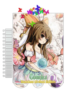 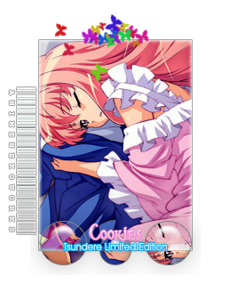 3//4 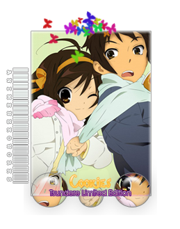 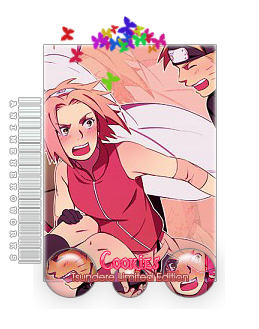 Wew, your cards really cute! But I think the texts are too small to read. Anyway, I like the cards! Nice work :3 |
-arisu-Apr 29, 2011 4:08 PM
|
Apr 29, 2011 9:44 AM
#40
xyBer_ said: Dark_LP said: hello everyone o Thanks for the tips of all, I've been practicing doing some cards, I think it does not evolve almost nothing, but it's just to register my work here ^^ I still think my cards are big, when I turn it down to size, they are all distorted I have a lot to improve yet, but I will not quit :D you should first resize them, then crop the part that you want... because resizing them after you've added borders, texts, patterns and other effects will surely make them look distorted especially on rounded cards ^^ how about something similar to this size or you can make it a little bit bigger than this also I suggest that if the background is just one color/plain (in rectangular shaped cards because I think it's looks okay on rounded ones), you can crop it a little bit more so the focus is on the character (something like the focal point of the card?) and so that there aren't much blank areas..though it really depends on the card maker :P these are just based on my experience and btw, you've quite improved ;D gambatte! oh, you mentioned on your previous post that you translate manga, what scanlation group are you part of? :3 Thanks for the tips, I'll try to follow them here :) and more with what you posted in 'Tipps and Tricks' I just saw now ò_ó I participated a scan Brazilian named 'ManKa' in 2006-2009, but all abandoned and failed ¬¬ and from there to here, I have been translating for myself, without disclosing or anything |
Apr 29, 2011 12:32 PM
#41
| Uff many posts here. Sry, but I rate the last three cards here. @ UsuiAyuzawa Your cards looks good. Great job ;) If you like, you can look for headphone, render it and put it on. @ black-ALICE Oh really you render it? You do a great job and I didn't see any mistakes ;) How long can the name be on the card? For card for Fairy Tale LE looks awesome :3 I love it ^^ @ cookies05 Your cards are awesome. I find nothing bad about your cards. So I count your cards as perfect. You know, you make better cards than I ever could do ;) I wanna hire you for my club. I can learn much from all you guys ^^ Thanks ^^ |
Nekro-NinApr 29, 2011 12:48 PM
Apr 29, 2011 3:53 PM
#42
Nekro-Nin said: Uff many posts here. Sry, but I rate the last three cards here. @ UsuiAyuzawa Your cards looks good. Great job ;) If you like, you can look for headphone, render it and put it on. @ black-ALICE Oh really you render it? You do a great job and I didn't see any mistakes ;) How long can the name be on the card? For card for Fairy Tale LE looks awesome :3 I love it ^^ @ cookies05 Your cards are awesome. I find nothing bad about your cards. So I count your cards as perfect. You know, you make better cards than I ever could do ;) I wanna hire you for my club. I can learn much from all you guys ^^ Thanks ^^ It's 10 characters max :3 |
|
Apr 30, 2011 1:40 AM
#43

| I think that I'll also ask for some tips, advices and opinions since I'm also new to this stuff. So plz take a look, tyvm ! :) Link : http://myanimelist.net/blog.php?eid=89277 And don't worry, just speak up even if it is harsh, I still have to learn a lot and I want to become really good. ^_^ Again tyvm. ps: I first used photostudio 5.5 (not photoshop), but I started using GIMP since the day before yesterday after I downloaded it. |
MamuruApr 30, 2011 4:28 AM
| Signature removed. Please follow the signature rules, as defined in the Site & Forum Guidelines. |
Apr 30, 2011 3:13 AM
#44
Mamuru said: I think that I'll also ask for some tips, advices and opinions since I'm also new to this stuff. So plz take a look, tyvm ! :) Link : http://myanimelist.net/blog.php?eid=89277 And don't worry, just speak up even if it is harsh, I still have to learn a lot and I want to become really good. ^_^ Again tyvm. ps: I first used photostudio 5.5 (not photoshop), but I started using GIMP since the day before yesterday af I downloaded it. The cards already good, but you can try to re-size it a bit for Touko and Haruhi card. :3 |
|
Apr 30, 2011 3:20 AM
#45
Mamuru said: I think that I'll also ask for some tips, advices and opinions since I'm also new to this stuff. So plz take a look, tyvm ! :) Link : http://myanimelist.net/blog.php?eid=89277 And don't worry, just speak up even if it is harsh, I still have to learn a lot and I want to become really good. ^_^ Again tyvm. ps: I first used photostudio 5.5 (not photoshop), but I started using GIMP since the day before yesterday af I downloaded it. actually, i'm only using photoshop, so i can't really explain clearly~ on your second graphics [black rock shooter one] i thought it would be more perfect if you didn't use outer glow for the outline of its pic, i guess you need border than outer glow for the pic... well, that's what i thought about your picture... if you ask me how, i'm sorry, i can't help you, [i didn't understand anything about GIMP] ^^ oh, yes... for all, i've done making my new profile layout, please tell me what part is wrong [i know it's for cards only, but i just want some help from all of you] thx in advance 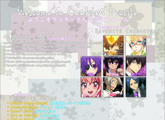 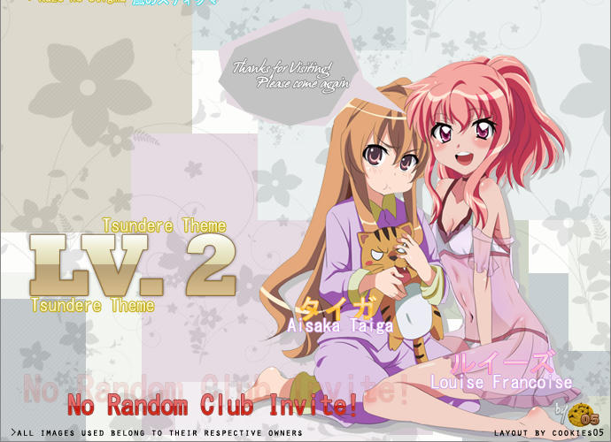 |
|
Apr 30, 2011 3:43 AM
#46
cookies05 said: oh, yes... for all, i've done making my new profile layout, please tell me what part is wrong [i know it's for cards only, but i just want some help from all of you] thx in advance Cute! :33 Like it! I didn't see something wrong with it, everything looks good Nice work! :)) |
|
Apr 30, 2011 3:59 AM
#47
| For nothin' :3 I'm in a huge need of staff aviavble to help me in editions....I wanna give a strike and the cards help at getting more members :3 oh,andcall me Soul-chan here and Lia-sama in LCS ^^ |
| |
Apr 30, 2011 4:41 AM
#48
black-ALICE said: Cute! :33 Like it! I didn't see something wrong with it, everything looks good Nice work! :)) so that's how is it... ^^ i'm glad then... |
|
Apr 30, 2011 6:09 AM
#49
| cookie,the profile looks awesome :) |
| |
Apr 30, 2011 3:24 PM
#50
 tell me what you think about it please :) |
| |
More topics from this board
» [members: closed] Nekomimi LExRay-chanx - May 12, 2012 |
34 |
by _greyce76
»»
Aug 7, 2012 2:14 AM |
|
Sticky: » [temporarily CLOSED]Official Membercards ( 1 2 3 )xRay-chanx - Apr 24, 2011 |
149 |
by xTsukinox3
»»
Jul 21, 2012 7:53 AM |
|
» [game] Four Letter Word Game ( 1 2 3 4 5 ... Last Page )Ryouzenpaku - Apr 28, 2011 |
481 |
by anck-su-namun
»»
Jun 25, 2012 1:38 PM |
|
» [members:closed]Random Picture SE part 6[admins:closed]xRay-chanx - May 3, 2012 |
10 |
by JohnLopez
»»
May 4, 2012 11:49 AM |
|
» [members:closed]Cards by Rookies Request ThreadxRay-chanx - Nov 25, 2011 |
29 |
by Kaito_Dragneel
»»
Apr 25, 2012 1:29 PM |