Vinland Saga
Available on Manga Store
New
Jun 9, 2023 6:04 AM
#1
| something about the character art of season 2 has been bothering me since the start, and I can't for the life of me understand what it is specifically, so help me out here, to make this easier: here's some generic shots from season 1:  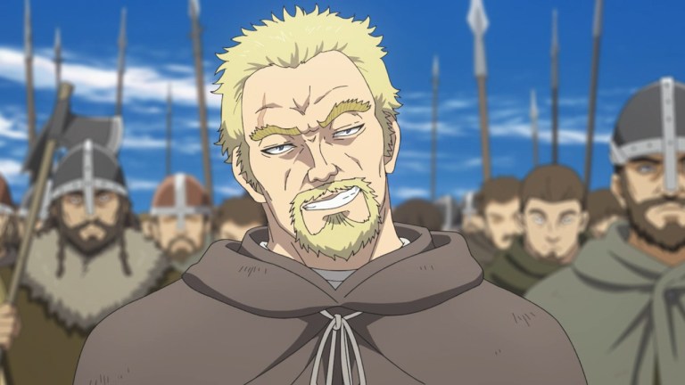 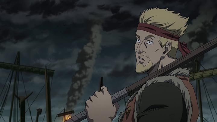 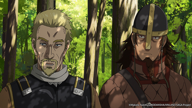 and here's some similar generic shots from season 2: 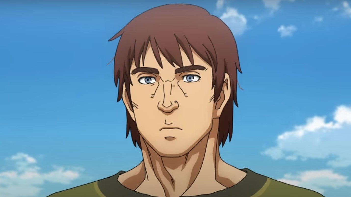 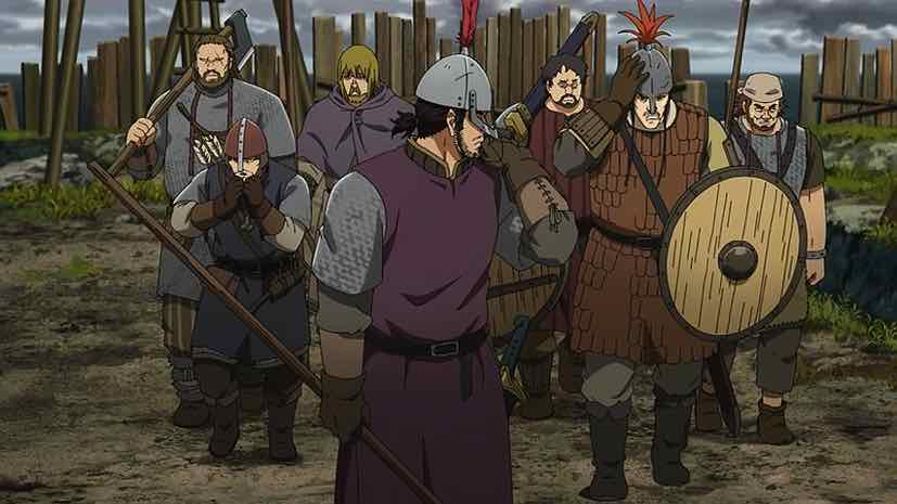 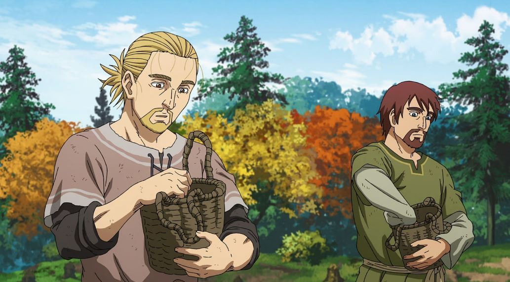 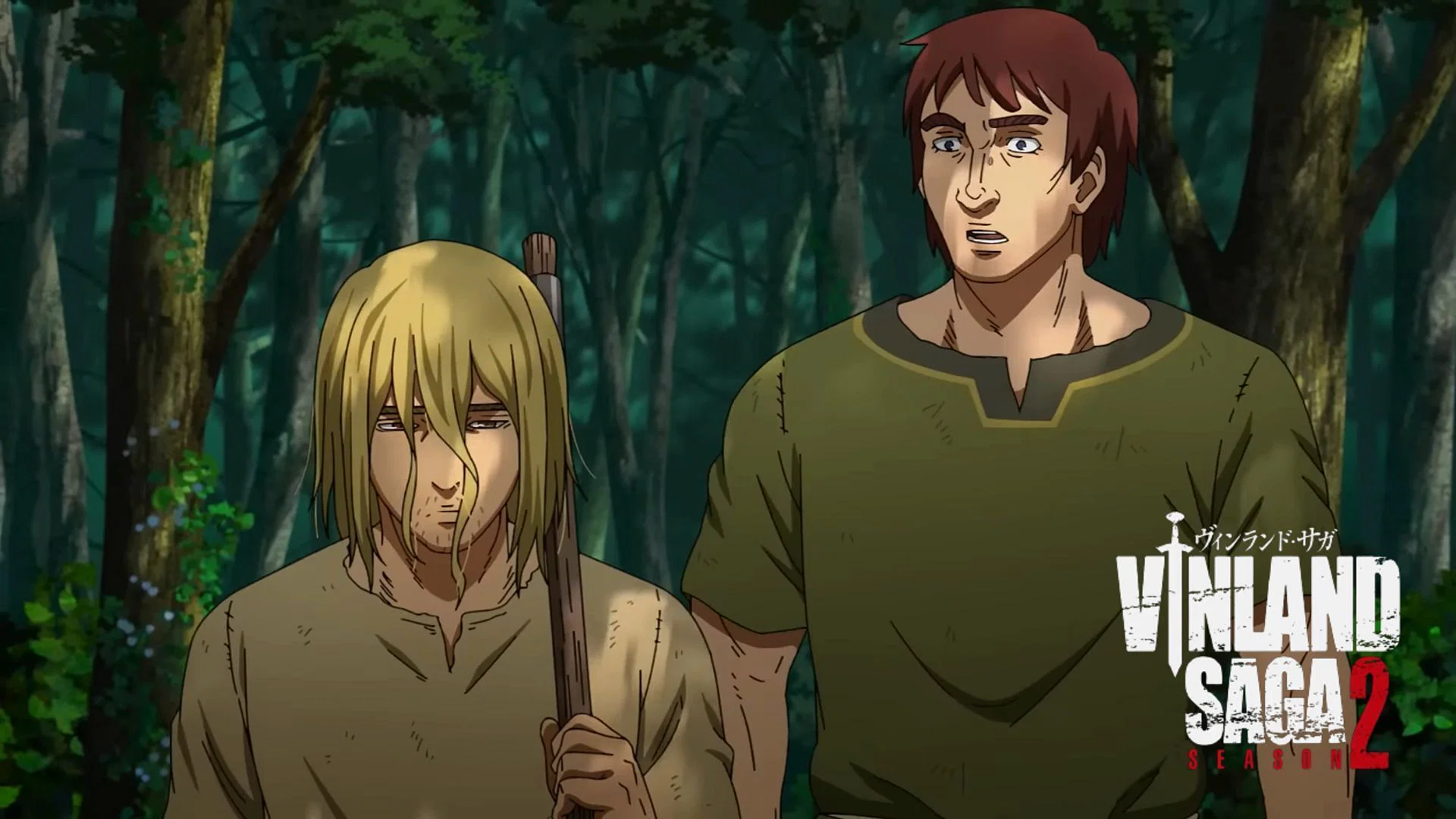 Here's the thing, I know the backgrounds are not nearly as detailed this season, that part is just factually true. if you don't think the backgrounds are worse you have probably just forgotten how good the backgrounds were in season 1.... but that's not the problem. there is something about the characters. for some reason they look more ""flat"". like they stick out of the screen more and have a harder time blending in the background... but the thing is... I sound like a crazy person to myself when I say it, cause when I look at the seasons side to side, I can not understand why it's like that. My best guess is that it's a mix of worse lighting, and making the character outlines thinner, but I'm talking out of my ass here. maybe it's the colouring, maybe it's the backgrounds... maybe maybe maybe i don't know. and I need your help to understand what is problem. |
| Also available at: YouTube Channel: https://www.youtube.com/channel/UCK8spdL1M_J-z0vO2C7jPLw Second Channel: https://www.youtube.com/@AshPolygonsDo/videos Why You Should Watch Akudama Drive: https://youtu.be/Yw0r52wRjgA A Love Letter To Anime「AMV」: https://youtu.be/YQyqxFM2m9Q My referral code to a website/app that gives you free money (a few cents a day) by using a few megabytes of your internet for file sharing. We both get a bonus if you use my link: https://r.honeygain.me/ARSHIA7942 |
Jun 9, 2023 6:16 AM
#2
Jun 9, 2023 6:28 AM
#3
Piromysl said: you clearly didn't read my postIt's almost like studio changed or something. it's obviously different because of the studio change, but that wasn't what I was talking about. I'm trying to figure out what part of the difference has made the characters stick out more (in a bad way) |
| Also available at: YouTube Channel: https://www.youtube.com/channel/UCK8spdL1M_J-z0vO2C7jPLw Second Channel: https://www.youtube.com/@AshPolygonsDo/videos Why You Should Watch Akudama Drive: https://youtu.be/Yw0r52wRjgA A Love Letter To Anime「AMV」: https://youtu.be/YQyqxFM2m9Q My referral code to a website/app that gives you free money (a few cents a day) by using a few megabytes of your internet for file sharing. We both get a bonus if you use my link: https://r.honeygain.me/ARSHIA7942 |
Jun 9, 2023 6:29 AM
#4
Skaldi2 said: that's one of my guesses too, but I'm not surethe colour saturation blends better, idk |
| Also available at: YouTube Channel: https://www.youtube.com/channel/UCK8spdL1M_J-z0vO2C7jPLw Second Channel: https://www.youtube.com/@AshPolygonsDo/videos Why You Should Watch Akudama Drive: https://youtu.be/Yw0r52wRjgA A Love Letter To Anime「AMV」: https://youtu.be/YQyqxFM2m9Q My referral code to a website/app that gives you free money (a few cents a day) by using a few megabytes of your internet for file sharing. We both get a bonus if you use my link: https://r.honeygain.me/ARSHIA7942 |
Jun 9, 2023 6:43 AM
#5
| Wit studio has the best lighting and texture effect in anime industry while mappa is....well mappa. Although the core staff remained the same, plenty of mappa employees did secondary effects |
Jun 9, 2023 6:48 AM
#6
Apolygon2 said: Piromysl said: you clearly didn't read my postIt's almost like studio changed or something. it's obviously different because of the studio change, but that wasn't what I was talking about. I'm trying to figure out what part of the difference has made the characters stick out more (in a bad way) Also thematical shift and timeskip. |
Jun 9, 2023 6:52 AM
#7
| My guess is the animator doesnt have much time to draw detailed face and the animation director doesnt have the time to correct the drawing, the AD maybe probably said "let's just release the episode on time we Will fix it in bluray" to the animator. Like in aot s4 p2 bluray they make a lot of changes in Chara expresion. |
| Monster of the week trope is a sign inability of the author to write a good plot so they introduce random ass villain to distract viewer with action. My English is not good. |
Jun 9, 2023 6:59 AM
#8
Sagenaker11 said: I wanted to say "well chainsawman didn't have this problem"Wit studio has the best lighting and texture effect in anime industry while mappa is....well mappa. Although the core staff remained the same, plenty of mappa employees did secondary effects but then I thought about it and realized that's mappa's best work animation wise, so it's not exactly their "normal standard" |
| Also available at: YouTube Channel: https://www.youtube.com/channel/UCK8spdL1M_J-z0vO2C7jPLw Second Channel: https://www.youtube.com/@AshPolygonsDo/videos Why You Should Watch Akudama Drive: https://youtu.be/Yw0r52wRjgA A Love Letter To Anime「AMV」: https://youtu.be/YQyqxFM2m9Q My referral code to a website/app that gives you free money (a few cents a day) by using a few megabytes of your internet for file sharing. We both get a bonus if you use my link: https://r.honeygain.me/ARSHIA7942 |
Jun 9, 2023 7:00 AM
#9
Piromysl said: Apolygon2 said: Piromysl said: It's almost like studio changed or something. it's obviously different because of the studio change, but that wasn't what I was talking about. I'm trying to figure out what part of the difference has made the characters stick out more (in a bad way) Also thematical shift and timeskip. how does that.. you ... why... I ..... you know what? just nevermind |
| Also available at: YouTube Channel: https://www.youtube.com/channel/UCK8spdL1M_J-z0vO2C7jPLw Second Channel: https://www.youtube.com/@AshPolygonsDo/videos Why You Should Watch Akudama Drive: https://youtu.be/Yw0r52wRjgA A Love Letter To Anime「AMV」: https://youtu.be/YQyqxFM2m9Q My referral code to a website/app that gives you free money (a few cents a day) by using a few megabytes of your internet for file sharing. We both get a bonus if you use my link: https://r.honeygain.me/ARSHIA7942 |
Jun 9, 2023 7:04 AM
#10
yomBlue said: hmmm.... I don't think this is something that can be just "fixed" for the blueray though.... My guess is the animator doesnt have much time to draw detailed face and the animation director doesnt have the time to correct the drawing, the AD maybe probably said "let's just release the episode on time we Will fix it in bluray" to the animator. Like in aot s4 p2 bluray they make a lot of changes in Chara expresion. also on a different note: Monster of the week trope is a sign inability of the author to write a good plot so they introduce random ass villain to distract viewer with action. that's only true if the monster of the weeks serve no purpose. sometimes the monster of the week IS the plot.I think a monster of the week is a negative, if you can remove the episode, without loosing anything. making the fight basically filler. |
| Also available at: YouTube Channel: https://www.youtube.com/channel/UCK8spdL1M_J-z0vO2C7jPLw Second Channel: https://www.youtube.com/@AshPolygonsDo/videos Why You Should Watch Akudama Drive: https://youtu.be/Yw0r52wRjgA A Love Letter To Anime「AMV」: https://youtu.be/YQyqxFM2m9Q My referral code to a website/app that gives you free money (a few cents a day) by using a few megabytes of your internet for file sharing. We both get a bonus if you use my link: https://r.honeygain.me/ARSHIA7942 |
Jun 9, 2023 7:14 AM
#11
| I think WIT had less line-work and more shadows, while MAPPA did the opposite. Backgrounds were pretty much the same both seasons, but since S1 involved more travelling it had a whole lot of Landscapes and Situations to shine. Season 2 was just as good imo. Art direction wise I definitely prefer Season 2, WIT had a few standout cuts throughout the season, but other times there were quite a few off-model characters and very stiff animation the majority of the season. MAPPA did have a sort of stuff animation overall but the consistency was amazing. Technically Season 2 is more impressive imo. As for exactly what it is that you were searching for, maybe the first line of my answer helped? I got carried away and I don't feel like deleting what I just said lol. But yeah I think it's the Shadows and Line-work. ALSO WIT studios character designs look less... geometrical? The lines are more flowy compared to MAPPA except the hair. |
Jun 9, 2023 7:18 AM
#12
Piromysl said: Apolygon2 said: Piromysl said: It's almost like studio changed or something. it's obviously different because of the studio change, but that wasn't what I was talking about. I'm trying to figure out what part of the difference has made the characters stick out more (in a bad way) Also thematical shift and timeskip. Ehhhhhh maybe a bit true for the backgrounds but not the characters lol. |
Jun 9, 2023 7:19 AM
#13
| the backgrounds in the recent ep were on par with s1 id say |
Jun 9, 2023 7:18 AM
#14
Apolygon2 said: bruh this was chainsaw mans biggest problem, it was bland boring and lifeless. Many people shit on cgi but it was actually good for anime standards but this was the actual culprit. Mappa always uses annoying color filters which you can clearly see in csm, aot p1/p2. Sagenaker11 said: I wanted to say "well chainsawman didn't have this problem"Wit studio has the best lighting and texture effect in anime industry while mappa is....well mappa. Although the core staff remained the same, plenty of mappa employees did secondary effects but then I thought about it and realized that's mappa's best work animation wise, so it's not exactly their "normal standard" Mappa actually has really good aniamtuon fluidity as we saw in jjk( mappa's best work)GOHS and csm but they always struggle when it comes to texture. The only popular show they did which ticks all the box was aot p3 but then again it was just hour long( although jjk s2 trailer looks clean af) Edit: btw s2 of vinalnd is actually better than s1 when it comes to production. Wit dropped the ball heavily during later half of s1( although they did went all out on 22-24 |
Sagenaker11Jun 9, 2023 7:24 AM
Jun 9, 2023 7:23 AM
#15
CreepHazard said: I think WIT had less line-work and more shadows, while MAPPA did the opposite. Backgrounds were pretty much the same both seasons, but since S1 involved more travelling it had a whole lot of Landscapes and Situations to shine. Season 2 was just as good imo. Art direction wise I definitely prefer Season 2, WIT had a few standout cuts throughout the season, but other times there were quite a few off-model characters and very stiff animation the majority of the season. MAPPA did have a sort of stuff animation overall but the consistency was amazing. Technically Season 2 is more impressive imo. As for exactly what it is that you were searching for, maybe the first line of my answer helped? I got carried away and I don't feel like deleting what I just said lol. But yeah I think it's the Shadows and Line-work. ALSO WIT studios character designs look less... geometrical? The lines are more flowy compared to MAPPA except the hair. you bring up a number of interesting points... but I think the backgrounds are 100% worse without a question. you will not find a single background even close to as good looking as these: 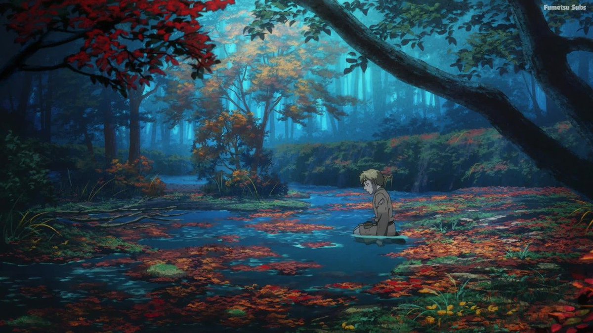 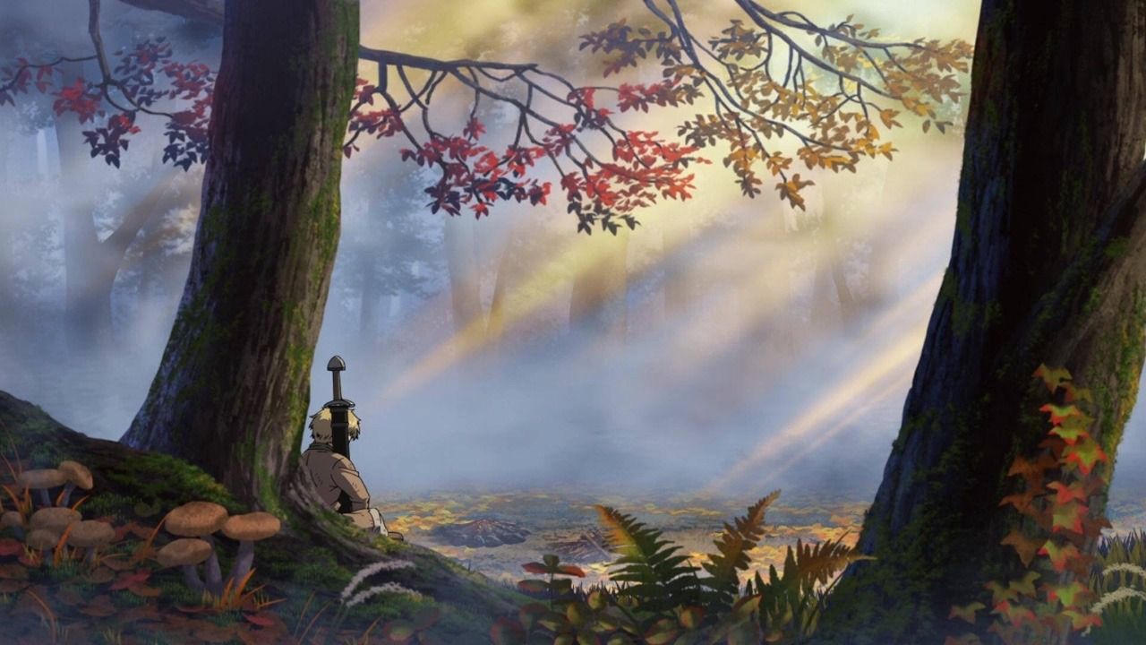 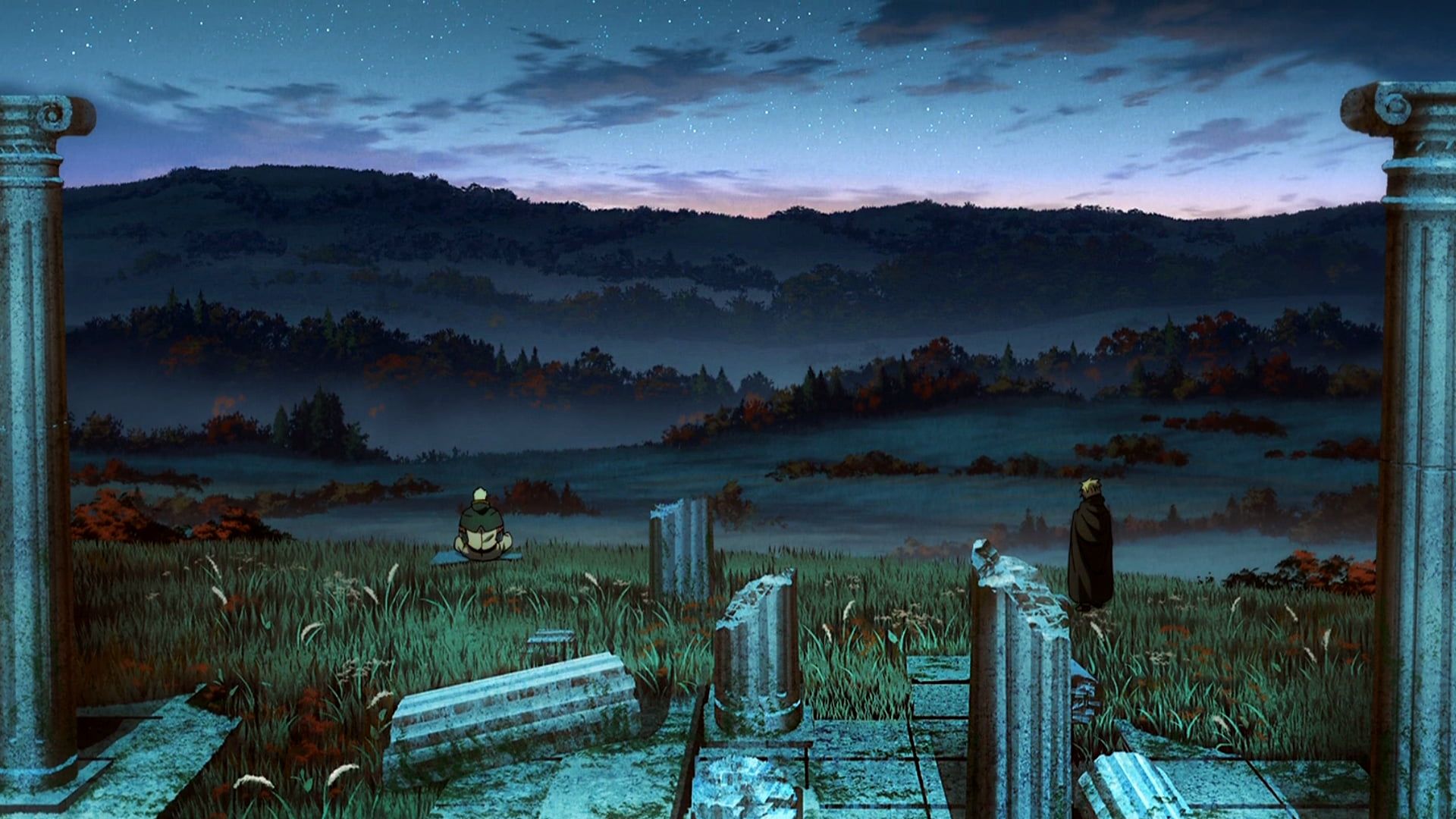 |
| Also available at: YouTube Channel: https://www.youtube.com/channel/UCK8spdL1M_J-z0vO2C7jPLw Second Channel: https://www.youtube.com/@AshPolygonsDo/videos Why You Should Watch Akudama Drive: https://youtu.be/Yw0r52wRjgA A Love Letter To Anime「AMV」: https://youtu.be/YQyqxFM2m9Q My referral code to a website/app that gives you free money (a few cents a day) by using a few megabytes of your internet for file sharing. We both get a bonus if you use my link: https://r.honeygain.me/ARSHIA7942 |
Jun 9, 2023 7:24 AM
#16
Apolygon2 said: Piromysl said: Apolygon2 said: Piromysl said: you clearly didn't read my postIt's almost like studio changed or something. it's obviously different because of the studio change, but that wasn't what I was talking about. I'm trying to figure out what part of the difference has made the characters stick out more (in a bad way) Also thematical shift and timeskip. how does that.. you ... why... I ..... you know what? just nevermind Have you even tried to considering what I said and that it might be deliberate change? Dramatic shift in theme is impossible to overlook and while faces of characters might be less detailed, what is way more detailed in fact in comparison to first season are HANDS. 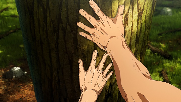 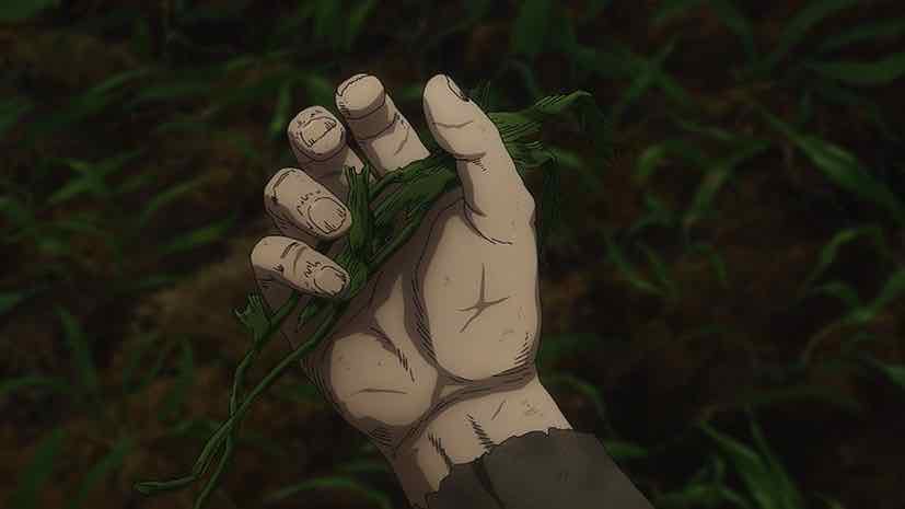 In first season we were following the story of warriors and high profile figures making history, thus faces were detailed, while in Farmland Saga we have literal slaves as main characters. The only thing they have and provide is physical labour, thus their hands are so damn well detailed and we get quite a lot of close-ups on them, while their faces are much less important. They are beautifully rugged as someone who spent lengthy time doing physical labour would have. That change you are bothered by is indeed symbolized by that thematical shift. At least it's my theory. |
Jun 9, 2023 7:26 AM
#17
Apolygon2 said: Sagenaker11 said: I wanted to say "well chainsawman didn't have this problem"Wit studio has the best lighting and texture effect in anime industry while mappa is....well mappa. Although the core staff remained the same, plenty of mappa employees did secondary effects but then I thought about it and realized that's mappa's best work animation wise, so it's not exactly their "normal standard" If that's their best work, then why does it have some problem with the animation that wasn't really a problem with JJK? CSM was overhyped and animation-wise, compared to the hype, it was weak. |
Jun 9, 2023 7:35 AM
#18
ktg said: Apolygon2 said: Sagenaker11 said: Wit studio has the best lighting and texture effect in anime industry while mappa is....well mappa. Although the core staff remained the same, plenty of mappa employees did secondary effects but then I thought about it and realized that's mappa's best work animation wise, so it's not exactly their "normal standard" If that's their best work, then why does it have some problem with the animation that wasn't really a problem with JJK? CSM was overhyped and animation-wise, compared to the hype, it was weak. well.... ok, the fights in jjk were better. but the animation of csm had something that 99% of action anime don't have, good animation in every scene. |
| Also available at: YouTube Channel: https://www.youtube.com/channel/UCK8spdL1M_J-z0vO2C7jPLw Second Channel: https://www.youtube.com/@AshPolygonsDo/videos Why You Should Watch Akudama Drive: https://youtu.be/Yw0r52wRjgA A Love Letter To Anime「AMV」: https://youtu.be/YQyqxFM2m9Q My referral code to a website/app that gives you free money (a few cents a day) by using a few megabytes of your internet for file sharing. We both get a bonus if you use my link: https://r.honeygain.me/ARSHIA7942 |
Jun 9, 2023 7:42 AM
#19
Piromysl said: Apolygon2 said: Piromysl said: Apolygon2 said: Piromysl said: you clearly didn't read my postIt's almost like studio changed or something. it's obviously different because of the studio change, but that wasn't what I was talking about. I'm trying to figure out what part of the difference has made the characters stick out more (in a bad way) Also thematical shift and timeskip. how does that.. you ... why... I ..... you know what? just nevermind Have you even tried to considering what I said and that it might be deliberate change? Dramatic shift in theme is impossible to overlook and while faces of characters might be less detailed, what is way more detailed in fact in comparison to first season are HANDS.   In first season we were following the story of warriors and high profile figures making history, thus faces were detailed, while in Farmland Saga we have literal slaves as main characters. The only thing they have and provide is physical labour, thus their hands are so damn well detailed and we get quite a lot of close-ups on them, while their faces are much less important. They are beautifully rugged as someone who spent lengthy time doing physical labour would have. That change you are bothered by is indeed symbolized by that thematical shift. At least it's my theory. that...... is actually pretty fair, I did not think of it like that. |
| Also available at: YouTube Channel: https://www.youtube.com/channel/UCK8spdL1M_J-z0vO2C7jPLw Second Channel: https://www.youtube.com/@AshPolygonsDo/videos Why You Should Watch Akudama Drive: https://youtu.be/Yw0r52wRjgA A Love Letter To Anime「AMV」: https://youtu.be/YQyqxFM2m9Q My referral code to a website/app that gives you free money (a few cents a day) by using a few megabytes of your internet for file sharing. We both get a bonus if you use my link: https://r.honeygain.me/ARSHIA7942 |
Jun 9, 2023 7:46 AM
#20
Apolygon2 said: ktg said: Apolygon2 said: Sagenaker11 said: I wanted to say "well chainsawman didn't have this problem"Wit studio has the best lighting and texture effect in anime industry while mappa is....well mappa. Although the core staff remained the same, plenty of mappa employees did secondary effects but then I thought about it and realized that's mappa's best work animation wise, so it's not exactly their "normal standard" If that's their best work, then why does it have some problem with the animation that wasn't really a problem with JJK? CSM was overhyped and animation-wise, compared to the hype, it was weak. well.... ok, the fights in jjk were better. but the animation of csm had something that 99% of action anime don't have, good animation in every scene. Lol, no. Overall animation was better in JJK. Currently that's the best animation-wise by MAPPA. While they did try to do some good animation in CSM, but they introduced a couple mistakes in animation that weren't there in earlier shows. It's actually not the first. They tried this with SnK where they also failed with this. Currently MAPPA can not be listed among the best studios probably because their tight schedules cause the qualities to drop compared to other top shows. It was pretty obvious especially when CSM aired. It was pretty hyped, but wasn't even in the top 3 in that season. |
Jun 9, 2023 7:47 AM
#21
Sagenaker11 said: texture.... sure.... maybeApolygon2 said: bruh this was chainsaw mans biggest problem, it was bland boring and lifeless. Many people shit on cgi but it was actually good for anime standards but this was the actual culprit. Mappa always uses annoying color filters which you can clearly see in csm, aot p1/p2. Sagenaker11 said: Wit studio has the best lighting and texture effect in anime industry while mappa is....well mappa. Although the core staff remained the same, plenty of mappa employees did secondary effects but then I thought about it and realized that's mappa's best work animation wise, so it's not exactly their "normal standard" Mappa actually has really good aniamtuon fluidity as we saw in jjk( mappa's best work)GOHS and csm but they always struggle when it comes to texture. The only popular show they did which ticks all the box was aot p3 but then again it was just hour long( although jjk s2 trailer looks clean af) Edit: btw s2 of vinalnd is actually better than s1 when it comes to production. Wit dropped the ball heavily during later half of s1( although they did went all out on 22-24 but the lighting of CSM is masterclass. and the characters do blend in with the backgrounds seemlessly. that's what I meant when I said it didn't have that poblem. also I like the filters... sue me lol on a different note. I can't understand why you would ever think s1 was worse looking. even putting the characters aside.... wit's backgrounds were on a completely different level. |
| Also available at: YouTube Channel: https://www.youtube.com/channel/UCK8spdL1M_J-z0vO2C7jPLw Second Channel: https://www.youtube.com/@AshPolygonsDo/videos Why You Should Watch Akudama Drive: https://youtu.be/Yw0r52wRjgA A Love Letter To Anime「AMV」: https://youtu.be/YQyqxFM2m9Q My referral code to a website/app that gives you free money (a few cents a day) by using a few megabytes of your internet for file sharing. We both get a bonus if you use my link: https://r.honeygain.me/ARSHIA7942 |
Jun 9, 2023 7:52 AM
#22
| the facial shadows are a lot less present making their faces feel flat because shadow is what gives depth |
 |
Jun 9, 2023 8:02 AM
#23
Sagenaker11 said: the lighting is better this season. S1 was grey and dull the whole seasonWit studio has the best lighting and texture effect in anime industry while mappa is....well mappa. Although the core staff remained the same, plenty of mappa employees did secondary effects |
Jun 9, 2023 8:04 AM
#24
ZachyMoof said: I think you may have nailed it on the head...the facial shadows are a lot less present making their faces feel flat because shadow is what gives depth it's the amount of shadows in the faces.... you're right thanks a ton man!!! |
| Also available at: YouTube Channel: https://www.youtube.com/channel/UCK8spdL1M_J-z0vO2C7jPLw Second Channel: https://www.youtube.com/@AshPolygonsDo/videos Why You Should Watch Akudama Drive: https://youtu.be/Yw0r52wRjgA A Love Letter To Anime「AMV」: https://youtu.be/YQyqxFM2m9Q My referral code to a website/app that gives you free money (a few cents a day) by using a few megabytes of your internet for file sharing. We both get a bonus if you use my link: https://r.honeygain.me/ARSHIA7942 |
Jun 9, 2023 8:05 AM
#25
ktg said: bro watched a 12 episode show with non stop character acting and said it wasn’t their best work ok bud, also how can you say a show (jjk) that has horrible backgrounds and the composting always being bad is better animated then csm?Apolygon2 said: Sagenaker11 said: Wit studio has the best lighting and texture effect in anime industry while mappa is....well mappa. Although the core staff remained the same, plenty of mappa employees did secondary effects but then I thought about it and realized that's mappa's best work animation wise, so it's not exactly their "normal standard" If that's their best work, then why does it have some problem with the animation that wasn't really a problem with JJK? CSM was overhyped and animation-wise, compared to the hype, it was weak. |
GavinyeetJun 9, 2023 8:14 AM
Jun 9, 2023 8:06 AM
#26
Gavinyeet said: bruh what lmaoSagenaker11 said: the lighting is better this season. S1 was grey and dull the whole seasonWit studio has the best lighting and texture effect in anime industry while mappa is....well mappa. Although the core staff remained the same, plenty of mappa employees did secondary effects it was more grey because it had more cloudy and night scenes. darker scenes being grey is not a sign of bad lighting. not even a little. |
| Also available at: YouTube Channel: https://www.youtube.com/channel/UCK8spdL1M_J-z0vO2C7jPLw Second Channel: https://www.youtube.com/@AshPolygonsDo/videos Why You Should Watch Akudama Drive: https://youtu.be/Yw0r52wRjgA A Love Letter To Anime「AMV」: https://youtu.be/YQyqxFM2m9Q My referral code to a website/app that gives you free money (a few cents a day) by using a few megabytes of your internet for file sharing. We both get a bonus if you use my link: https://r.honeygain.me/ARSHIA7942 |
Jun 9, 2023 8:08 AM
#27
ktg said: jjk didn't even attempt to have even close to have detailed character acting.Apolygon2 said: ktg said: Apolygon2 said: Sagenaker11 said: I wanted to say "well chainsawman didn't have this problem"Wit studio has the best lighting and texture effect in anime industry while mappa is....well mappa. Although the core staff remained the same, plenty of mappa employees did secondary effects but then I thought about it and realized that's mappa's best work animation wise, so it's not exactly their "normal standard" If that's their best work, then why does it have some problem with the animation that wasn't really a problem with JJK? CSM was overhyped and animation-wise, compared to the hype, it was weak. well.... ok, the fights in jjk were better. but the animation of csm had something that 99% of action anime don't have, good animation in every scene. Lol, no. Overall animation was better in JJK. Currently that's the best animation-wise by MAPPA. While they did try to do some good animation in CSM, but they introduced a couple mistakes in animation that weren't there in earlier shows. It's actually not the first. They tried this with SnK where they also failed with this. Currently MAPPA can not be listed among the best studios probably because their tight schedules cause the qualities to drop compared to other top shows. It was pretty obvious especially when CSM aired. It was pretty hyped, but wasn't even in the top 3 in that season. amazing animation with minor mistakes >>>> no animation |
| Also available at: YouTube Channel: https://www.youtube.com/channel/UCK8spdL1M_J-z0vO2C7jPLw Second Channel: https://www.youtube.com/@AshPolygonsDo/videos Why You Should Watch Akudama Drive: https://youtu.be/Yw0r52wRjgA A Love Letter To Anime「AMV」: https://youtu.be/YQyqxFM2m9Q My referral code to a website/app that gives you free money (a few cents a day) by using a few megabytes of your internet for file sharing. We both get a bonus if you use my link: https://r.honeygain.me/ARSHIA7942 |
Jun 9, 2023 8:09 AM
#28
Apolygon2 said: nah love S1 but the colors always felt dull which this season doesn’t have that problemGavinyeet said: bruh what lmaoSagenaker11 said: Wit studio has the best lighting and texture effect in anime industry while mappa is....well mappa. Although the core staff remained the same, plenty of mappa employees did secondary effects it was more grey because it had more cloudy and night scenes. darker scenes being grey is not a sign of bad lighting. not even a little. |
Jun 9, 2023 8:11 AM
#29
| this are low priority frames vs high priority frames so obviously low priority means lower quality there are plenty of high quality frames on season 2 too aka strong AD (animation direction) work |
Jun 9, 2023 8:15 AM
#30
Apolygon2 said: Sagenaker11 said: texture.... sure.... maybeApolygon2 said: Sagenaker11 said: I wanted to say "well chainsawman didn't have this problem"Wit studio has the best lighting and texture effect in anime industry while mappa is....well mappa. Although the core staff remained the same, plenty of mappa employees did secondary effects but then I thought about it and realized that's mappa's best work animation wise, so it's not exactly their "normal standard" Mappa actually has really good aniamtuon fluidity as we saw in jjk( mappa's best work)GOHS and csm but they always struggle when it comes to texture. The only popular show they did which ticks all the box was aot p3 but then again it was just hour long( although jjk s2 trailer looks clean af) Edit: btw s2 of vinalnd is actually better than s1 when it comes to production. Wit dropped the ball heavily during later half of s1( although they did went all out on 22-24 but the lighting of CSM is masterclass. and the characters do blend in with the backgrounds seemlessly. that's what I meant when I said it didn't have that poblem. also I like the filters... sue me lol Well lets agree to disagree Apolygon2 said: although not by much s2 actually looked slightly better than s1on a different note. I can't understand why you would ever think s1 was worse looking. even putting the characters aside.... wit's backgrounds were on a completely different level. The only ep were wits background was leagues above was ep5( that episode were kid thorfinn was wandering in forest) other than that rest of them while good, didn't look much better than s2. S1 also had less fluidity and meh cgi( thors fight in ep 1 and many soldier scenes) and not to mention in second half the production was actually questionable, there were scenes were background character barely had any details lol. S2 on other hand had better character details, aniamtion fluidity and barely any cgi( atleast to my eyes). For example They literally 2d hand drew gardar's horse legs when he was approaching ketils farm while most of them actually would have just used cgi. Not to mention this is literally the only anime I've seen where they give so much emphasis on hands. In short s2 had less inconsistencies compared to s1, the production quality actually got stronger as the series progressed which is a rare sight in anime |
Jun 9, 2023 8:19 AM
#31
deg said: yes but the shots I took from s1 aren't high priority either.this are low priority frames vs high priority frames so obviously low priority means lower quality there are plenty of high quality frames on season 2 too aka strong AD (animation direction) work both seasons obviously look amazing in high priority shots: 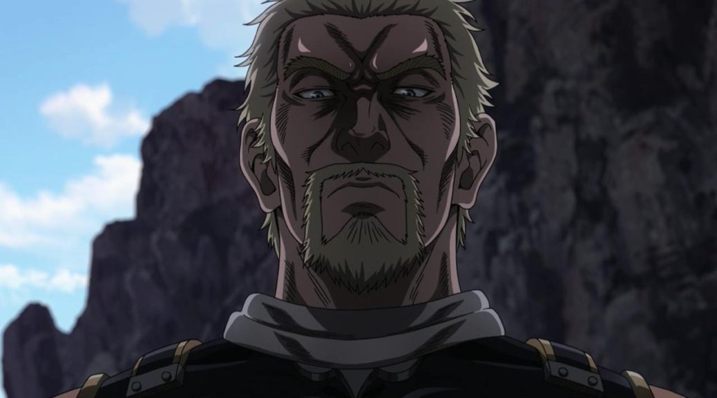 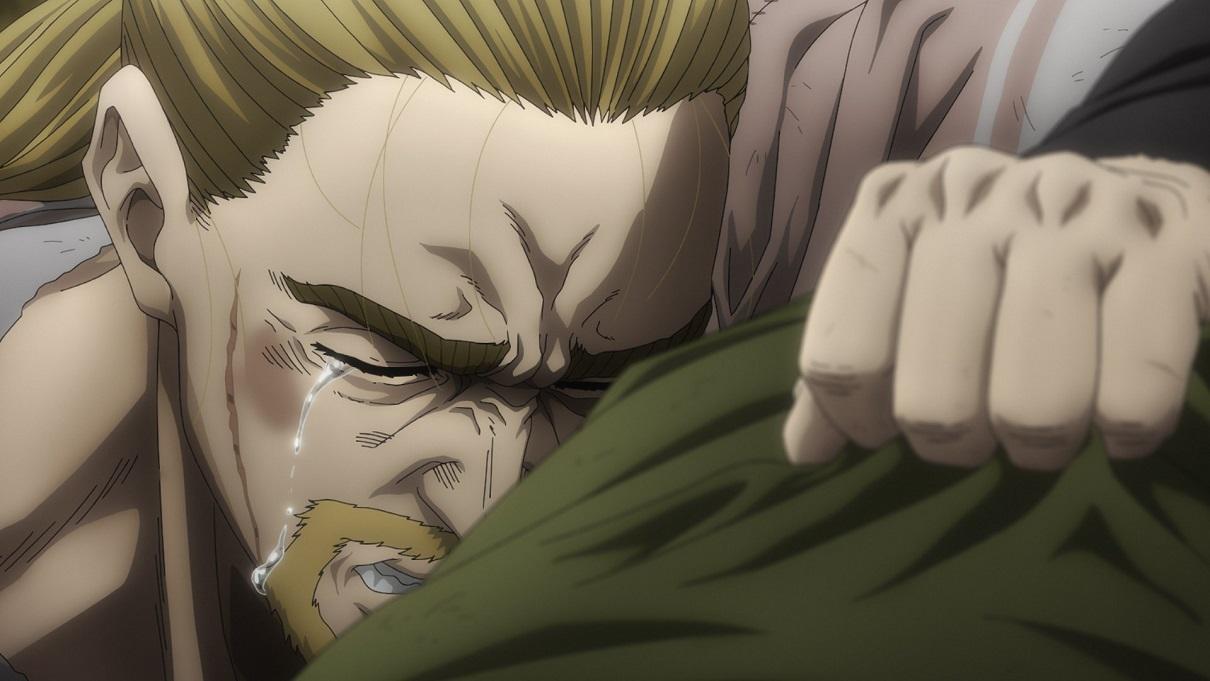 |
APolygons2Jun 9, 2023 8:28 AM
| Also available at: YouTube Channel: https://www.youtube.com/channel/UCK8spdL1M_J-z0vO2C7jPLw Second Channel: https://www.youtube.com/@AshPolygonsDo/videos Why You Should Watch Akudama Drive: https://youtu.be/Yw0r52wRjgA A Love Letter To Anime「AMV」: https://youtu.be/YQyqxFM2m9Q My referral code to a website/app that gives you free money (a few cents a day) by using a few megabytes of your internet for file sharing. We both get a bonus if you use my link: https://r.honeygain.me/ARSHIA7942 |
Jun 9, 2023 8:41 AM
#32
| stop hatin and enjoy lol nothin rlly changed. Season 2’s background art and compositing is much better too |
Jun 9, 2023 8:50 AM
#33
YMW18 said: stop hatin and enjoy lol nothin rlly changed. Season 2’s background art and compositing is much better too i disagree with the second half what you said. but i am not hating, this is my anime of the year so far. its a 9 or 10/10 for me. |
| Also available at: YouTube Channel: https://www.youtube.com/channel/UCK8spdL1M_J-z0vO2C7jPLw Second Channel: https://www.youtube.com/@AshPolygonsDo/videos Why You Should Watch Akudama Drive: https://youtu.be/Yw0r52wRjgA A Love Letter To Anime「AMV」: https://youtu.be/YQyqxFM2m9Q My referral code to a website/app that gives you free money (a few cents a day) by using a few megabytes of your internet for file sharing. We both get a bonus if you use my link: https://r.honeygain.me/ARSHIA7942 |
Jun 9, 2023 10:35 AM
#35
just in case you didn't know, both seasons share the same background artist yuusuke takeda (also responsible for the background art for csm). so maybe the difference comes from the historical significance of the places that s1 covered like the Roman ruins, mercia and all that making it stand out more from s2's bgs. even though I'd say quality wise, think they're pretty much on the same scale.         |
LitbaeJun 10, 2023 7:32 PM
Jun 9, 2023 10:52 AM
#36
Litbae said: just in case you didn't know, both seasons share the same background artist yuusuke takeda (also responsible for the background art for csm). so maybe the difference comes from the historical significance of the places that s1 covered like the Roman columns, mercia and all that making it stand out more from s2's bgs. even though I'd say quality wise, think they're pretty much on the same scale.          ok, I'm pretty sure at least some of these are from the ed, but whatever. the 4th one is the only one that I would consider on part with the best of s1. the thing is, not all the backgrounds are done by the same team. the specially breath taking backgrounds of season 1, were done by a team that is no longer working on season 2. I forgot what their name was but I looked into it a while back due to wanting to watch more of the series they worked on. I remember not finding any other series that they had a big role in, BUT I did find out that they did the backgrounds for attack on titan final season part 2 ed: https://www.youtube.com/watch?v=-ZmAcmUSMHM and honestly after knowing that, it's pretty noticeable. their art is just on a completely different level. In general I don't think s2 backgrounds are bad at all. I just think vinland s1 has some of the best backgrounds in tv anime with only a handful of series being comparable to it. |
| Also available at: YouTube Channel: https://www.youtube.com/channel/UCK8spdL1M_J-z0vO2C7jPLw Second Channel: https://www.youtube.com/@AshPolygonsDo/videos Why You Should Watch Akudama Drive: https://youtu.be/Yw0r52wRjgA A Love Letter To Anime「AMV」: https://youtu.be/YQyqxFM2m9Q My referral code to a website/app that gives you free money (a few cents a day) by using a few megabytes of your internet for file sharing. We both get a bonus if you use my link: https://r.honeygain.me/ARSHIA7942 |
Jun 9, 2023 11:19 AM
#37
Litbae said: Vinland Saga is really a beautiful anime. I haven't seen anything like this before.just in case you didn't know, both seasons share the same background artist yuusuke takeda (also responsible for the background art for csm). so maybe the difference comes from the historical significance of the places that s1 covered like the Roman columns, mercia and all that making it stand out more from s2's bgs. even though I'd say quality wise, think they're pretty much on the same scale.          |
Jun 9, 2023 11:49 AM
#38
| Season 1 was done by studio WIT. Season 2 however was done by Mappa. So just by that you’re gonna have changes, additionally Mappa was managing a lot of projects during this time so some series suffered. I agree season 2 looks worse, people like to hype up Mappa but WIT should have kept it. I’d recommend reading the manga from this point, one because the next arc is the best arc in the series, and the art is just incredible compared to what Mappa has offered for season 2 and I assume they’ll offer for season 3. |
Jun 9, 2023 11:53 AM
#39
Apolygon2 said: CreepHazard said: I think WIT had less line-work and more shadows, while MAPPA did the opposite. Backgrounds were pretty much the same both seasons, but since S1 involved more travelling it had a whole lot of Landscapes and Situations to shine. Season 2 was just as good imo. Art direction wise I definitely prefer Season 2, WIT had a few standout cuts throughout the season, but other times there were quite a few off-model characters and very stiff animation the majority of the season. MAPPA did have a sort of stuff animation overall but the consistency was amazing. Technically Season 2 is more impressive imo. As for exactly what it is that you were searching for, maybe the first line of my answer helped? I got carried away and I don't feel like deleting what I just said lol. But yeah I think it's the Shadows and Line-work. ALSO WIT studios character designs look less... geometrical? The lines are more flowy compared to MAPPA except the hair. you bring up a number of interesting points... but I think the backgrounds are 100% worse without a question. you will not find a single background even close to as good looking as these:    I think season 2 backgrounds just got a bit monotonous tbh, always the woods and fields. |
Jun 9, 2023 11:57 AM
#40
Apolygon2 said: Sagenaker11 said: texture.... sure.... maybeApolygon2 said: Sagenaker11 said: I wanted to say "well chainsawman didn't have this problem"Wit studio has the best lighting and texture effect in anime industry while mappa is....well mappa. Although the core staff remained the same, plenty of mappa employees did secondary effects but then I thought about it and realized that's mappa's best work animation wise, so it's not exactly their "normal standard" Mappa actually has really good aniamtuon fluidity as we saw in jjk( mappa's best work)GOHS and csm but they always struggle when it comes to texture. The only popular show they did which ticks all the box was aot p3 but then again it was just hour long( although jjk s2 trailer looks clean af) Edit: btw s2 of vinalnd is actually better than s1 when it comes to production. Wit dropped the ball heavily during later half of s1( although they did went all out on 22-24 but the lighting of CSM is masterclass. and the characters do blend in with the backgrounds seemlessly. that's what I meant when I said it didn't have that poblem. also I like the filters... sue me lol on a different note. I can't understand why you would ever think s1 was worse looking. even putting the characters aside.... wit's backgrounds were on a completely different level. For both season 1 and 2, the backgrounds were made by Studio Bamboo, not the animation studio. A separate studio was in charge of both the season's backgrounds. This is the team you were looking for that did ED background for AOT S4 Part 2 They seem to be uncredited for VS season 2, but I'm pretty sure they're still incharge tbh. They also did the backgrounds for Chainsaw Man Actually I think it's the Studio Yuusuke Takeda is associated with. |
CreepHazardJun 9, 2023 12:09 PM
Jun 9, 2023 12:06 PM
#41
Apolygon2 said: CreepHazard said: I think WIT had less line-work and more shadows, while MAPPA did the opposite. Backgrounds were pretty much the same both seasons, but since S1 involved more travelling it had a whole lot of Landscapes and Situations to shine. Season 2 was just as good imo. Art direction wise I definitely prefer Season 2, WIT had a few standout cuts throughout the season, but other times there were quite a few off-model characters and very stiff animation the majority of the season. MAPPA did have a sort of stuff animation overall but the consistency was amazing. Technically Season 2 is more impressive imo. As for exactly what it is that you were searching for, maybe the first line of my answer helped? I got carried away and I don't feel like deleting what I just said lol. But yeah I think it's the Shadows and Line-work. ALSO WIT studios character designs look less... geometrical? The lines are more flowy compared to MAPPA except the hair. you bring up a number of interesting points... but I think the backgrounds are 100% worse without a question. you will not find a single background even close to as good looking as these:    Holy sh*t man!!! I had totally forgotten how crazy these bg were.... Man I have been shocked by Wit studio.... From their work from about 5 yrs before... I want same or nearly same commitment from Mappa for Next season...... And again.... man I can't look away from these overy beautiful bgs..... |
Jun 9, 2023 12:21 PM
#42
Chilli_ said: Season 1 was done by studio WIT. Season 2 however was done by Mappa. So just by that you’re gonna have changes, additionally Mappa was managing a lot of projects during this time so some series suffered. I agree season 2 looks worse, people like to hype up Mappa but WIT should have kept it. I’d recommend reading the manga from this point, one because the next arc is the best arc in the series, and the art is just incredible compared to what Mappa has offered for season 2 and I assume they’ll offer for season 3. I rarely read manga. it's just not for me. unless the anime is significantly worse I always stay anime only. but thanks for the suggestion :D |
| Also available at: YouTube Channel: https://www.youtube.com/channel/UCK8spdL1M_J-z0vO2C7jPLw Second Channel: https://www.youtube.com/@AshPolygonsDo/videos Why You Should Watch Akudama Drive: https://youtu.be/Yw0r52wRjgA A Love Letter To Anime「AMV」: https://youtu.be/YQyqxFM2m9Q My referral code to a website/app that gives you free money (a few cents a day) by using a few megabytes of your internet for file sharing. We both get a bonus if you use my link: https://r.honeygain.me/ARSHIA7942 |
Jun 9, 2023 12:23 PM
#43
CreepHazard said: Apolygon2 said: Sagenaker11 said: Apolygon2 said: bruh this was chainsaw mans biggest problem, it was bland boring and lifeless. Many people shit on cgi but it was actually good for anime standards but this was the actual culprit. Mappa always uses annoying color filters which you can clearly see in csm, aot p1/p2. Sagenaker11 said: I wanted to say "well chainsawman didn't have this problem"Wit studio has the best lighting and texture effect in anime industry while mappa is....well mappa. Although the core staff remained the same, plenty of mappa employees did secondary effects but then I thought about it and realized that's mappa's best work animation wise, so it's not exactly their "normal standard" Mappa actually has really good aniamtuon fluidity as we saw in jjk( mappa's best work)GOHS and csm but they always struggle when it comes to texture. The only popular show they did which ticks all the box was aot p3 but then again it was just hour long( although jjk s2 trailer looks clean af) Edit: btw s2 of vinalnd is actually better than s1 when it comes to production. Wit dropped the ball heavily during later half of s1( although they did went all out on 22-24 but the lighting of CSM is masterclass. and the characters do blend in with the backgrounds seemlessly. that's what I meant when I said it didn't have that poblem. also I like the filters... sue me lol on a different note. I can't understand why you would ever think s1 was worse looking. even putting the characters aside.... wit's backgrounds were on a completely different level. For both season 1 and 2, the backgrounds were made by Studio Bamboo, not the animation studio. A separate studio was in charge of both the season's backgrounds. This is the team you were looking for that did ED background for AOT S4 Part 2 They seem to be uncredited for VS season 2, but I'm pretty sure they're still incharge tbh. They also did the backgrounds for Chainsaw Man Actually I think it's the Studio Yuusuke Takeda is associated with. I just checked. It is studio bamboo, but they are only credited on working on the first episode of s2, while they are credited as working on all of s1. |
| Also available at: YouTube Channel: https://www.youtube.com/channel/UCK8spdL1M_J-z0vO2C7jPLw Second Channel: https://www.youtube.com/@AshPolygonsDo/videos Why You Should Watch Akudama Drive: https://youtu.be/Yw0r52wRjgA A Love Letter To Anime「AMV」: https://youtu.be/YQyqxFM2m9Q My referral code to a website/app that gives you free money (a few cents a day) by using a few megabytes of your internet for file sharing. We both get a bonus if you use my link: https://r.honeygain.me/ARSHIA7942 |
Jun 9, 2023 12:28 PM
#44
Apolygon2 said: CreepHazard said: Apolygon2 said: Sagenaker11 said: texture.... sure.... maybeApolygon2 said: bruh this was chainsaw mans biggest problem, it was bland boring and lifeless. Many people shit on cgi but it was actually good for anime standards but this was the actual culprit. Mappa always uses annoying color filters which you can clearly see in csm, aot p1/p2. Sagenaker11 said: I wanted to say "well chainsawman didn't have this problem"Wit studio has the best lighting and texture effect in anime industry while mappa is....well mappa. Although the core staff remained the same, plenty of mappa employees did secondary effects but then I thought about it and realized that's mappa's best work animation wise, so it's not exactly their "normal standard" Mappa actually has really good aniamtuon fluidity as we saw in jjk( mappa's best work)GOHS and csm but they always struggle when it comes to texture. The only popular show they did which ticks all the box was aot p3 but then again it was just hour long( although jjk s2 trailer looks clean af) Edit: btw s2 of vinalnd is actually better than s1 when it comes to production. Wit dropped the ball heavily during later half of s1( although they did went all out on 22-24 but the lighting of CSM is masterclass. and the characters do blend in with the backgrounds seemlessly. that's what I meant when I said it didn't have that poblem. also I like the filters... sue me lol on a different note. I can't understand why you would ever think s1 was worse looking. even putting the characters aside.... wit's backgrounds were on a completely different level. For both season 1 and 2, the backgrounds were made by Studio Bamboo, not the animation studio. A separate studio was in charge of both the season's backgrounds. This is the team you were looking for that did ED background for AOT S4 Part 2 They seem to be uncredited for VS season 2, but I'm pretty sure they're still incharge tbh. They also did the backgrounds for Chainsaw Man Actually I think it's the Studio Yuusuke Takeda is associated with. I just checked. It is studio bamboo, but they are only credited on working on the first episode of s2, while they are credited as working on all of s1. yeah I think it could be updated. If it's actually true that they only worked on episode 1 then MAPPA is officially a competitor for best background arts because goddamn! |
Jun 9, 2023 4:44 PM
#45
| It's definetely thw line-work for me. Mappa's just feel very messy using more lines, and them being thicker and darker. Wit's was smoother. Also I'm not a big fan of the character designs from Mappa, they make the eyes smaller from the manga and the noses bigger, they look kinda uglier in general. Like Thorfinn is like 19 and looks 35, I won't say that's the case in the manga. Another problem is the lack of detail in drawings in certain scenes, specially during the first cour. At least in the second cour the animation got significantly better and there are some really fucking good scenes. But overall the art in the manga is just unmatched, and Mappa didn't get even closer to its quality |
Jun 9, 2023 5:29 PM
#46
Apolygon2 said: something about the character art of season 2 has been bothering me since the start, and I can't for the life of me understand what it is specifically, so help me out here, to make this easier: here's some generic shots from season 1:     and here's some similar generic shots from season 2:     Here's the thing, I know the backgrounds are not nearly as detailed this season, that part is just factually true. if you don't think the backgrounds are worse you have probably just forgotten how good the backgrounds were in season 1.... but that's not the problem. there is something about the characters. for some reason they look more ""flat"". like they stick out of the screen more and have a harder time blending in the background... but the thing is... I sound like a crazy person to myself when I say it, cause when I look at the seasons side to side, I can not understand why it's like that. My best guess is that it's a mix of worse lighting, and making the character outlines thinner, but I'm talking out of my ass here. maybe it's the colouring, maybe it's the backgrounds... maybe maybe maybe i don't know. and I need your help to understand what is problem. It's Studio MAPPA, so what? |
Jun 9, 2023 9:34 PM
#47
| the immediate difference i notice in the examples is the shading in the faces, it adds depth in the S1 shots |
Jun 9, 2023 11:08 PM
#48
| it has the mappa style where it looks more gritty or almost more boring not saying it bad but yeah definitely a change I for one preferred season 1 style more |
Jun 9, 2023 11:25 PM
#49
ZXEAN said: Litbae said: Vinland Saga is really a beautiful anime. I haven't seen anything like this before.just in case you didn't know, both seasons share the same background artist yuusuke takeda (also responsible for the background art for csm). so maybe the difference comes from the historical significance of the places that s1 covered like the Roman columns, mercia and all that making it stand out more from s2's bgs. even though I'd say quality wise, think they're pretty much on the same scale.          I agree, one of THE BEST seinen anime I've ever witness, it's just on a whole 'nother level. PEAK anime. |
Jun 10, 2023 12:28 AM
#50
Piromysl said: that doesn't matter when the core staff are the same lolIt's almost like studio changed or something. |
More topics from this board
Poll: » Vinland Saga Season 2 Episode 18 Discussion ( 1 2 3 4 5 ... Last Page )Stark700 - May 8, 2023 |
312 |
by -hzl
»»
Jan 17, 2:18 AM |
|
Poll: » Vinland Saga Season 2 Episode 17 Discussion ( 1 2 3 4 5 ... Last Page )Stark700 - May 1, 2023 |
374 |
by -hzl
»»
Jan 17, 1:45 AM |
|
Poll: » Vinland Saga Season 2 Episode 24 Discussion ( 1 2 3 4 5 ... Last Page )Stark700 - Jun 19, 2023 |
519 |
by adZinco
»»
Jan 14, 5:16 PM |
|
Poll: » Vinland Saga Season 2 Episode 9 Discussion ( 1 2 3 4 5 ... Last Page )Stark700 - Mar 6, 2023 |
387 |
by catzolasnahouse
»»
Jan 9, 10:08 AM |
|
Poll: » Vinland Saga Season 2 Episode 13 Discussion ( 1 2 3 4 )Stark700 - Apr 3, 2023 |
161 |
by ojuKoratoJ
»»
Jan 6, 9:05 AM |
