Before I start talking about shapes, there's something important to be said. What I'm going to say in this post was not created by anyone. It was based on studies about how humans naturally interpret certain shapes; it's tied no us. And this is used by character designers to give us information about the characters. The goal is to make the information as clear as possible, so that most people are able to 'read' it.
Shapes are one of the most important elements of character design, since they are directly related to the silhouette. Information can be passed through a lot of ways, but there are certain priorities. First, the silhouette, the most important thing. Second, the surface details. And third, the facial expression. Yes, facial expressions are just something secondary in character design, that should only reinforce what's going on in the rest of the body. When you want do address a particular emotion that can't be expressed through clothes or props, you go for poses. Poses can become the 'mark' of your character, facial expressions, hardly.
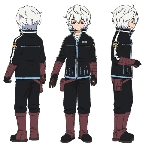
There are two kinds of shapes for character design, basically. The ones that contour a character, that make up his silhouette; and the ones that are in the surface of it. The former ones are the most important. Every character is based around variations of the three basic shapes: triangles, circles and squares. Take an example:

His head is a circle. Everything else is pretty much composed of squares (legs, arms, etc.). Some characters will be more complex, with more modifications of shapes, but every single character can be broken down in those three basic shapes.
Also, something important: a design must be organic in order to be interesting. An "organic" design means avoiding too much repetitions. Variety in shapes and sizes are necessary in order to create something interesting. Symmetry must be avoided as well. It's dull and boring. Contrast is what makes things interesting.
Now, to the most important part: the meanings.
Squares mean stability, trust, honesty, order, conformity, safeness, equality and masculinity.
Triangles mean action, aggressiveness, energy, archness, conflict and tension.
Circles mean fullness, grace, playfulness, comfort, unity, protection and puerility.
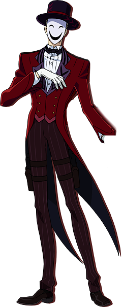
Another example:

This is a villain. Notice the presence of triangles through all his clothes and face, that indicate aggressiveness and archness. Even his whole silhouette has a triangle shape.
If you combine shapes, it will result in a "combined meaning". For example, rounded triangles can mean aggressive as a form of protection, since triangles mean aggressive and circles, protection. Got it?
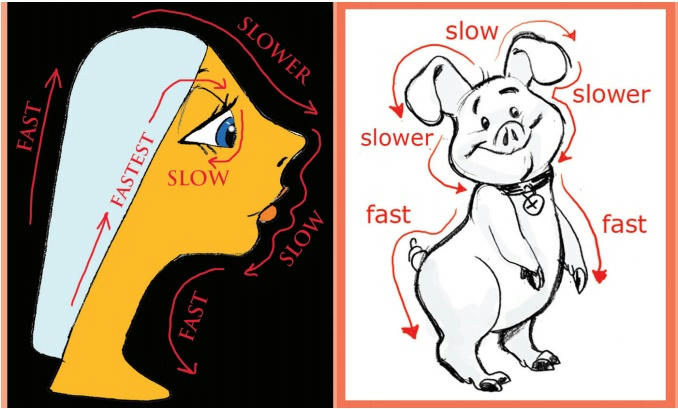
Last but not least, there's this:

Our eyes travel at different speeds when it comes to curved and straight forms. Curved, slower; straight, faster. The most important parts of the design should be curved, because there's where our eyes will stay the longest.
On a side note, this is something unrelated to the subject, but I didn't know where to write it, so... It's important to have designs follow a certain pattern, or be at least similar to some extent in the same work. Take for example, Snow White, by Disney. A flaw in the character design is that the dwarfs look strange next to her. Their designs have different styles and don't go well together. A pattern is needed to make the designs believable. This doesn't mean they have to have the same faces or anything like that, don't misunderstand me.
So that's it for today, next is colors.
|
