New
Feb 12, 2015 6:52 PM
#1

| [center]Those that wish to have their artwork critiqued will upload within this thread. Put the images in spoilers, ask for people specifically (and only those that are asked will do the critiquing) or just ask to be critiqued. [b]To put images in spoilers [spoiler.] put image here [spoiler/.] with out the "."[b][/spoiler] |
UglySlimeFeb 18, 2015 10:11 AM
| They said "There is no santa clause" I simply asked them "If santa clause isn't real then are you?" After that the voices in my head stopped speaking to me |
Feb 14, 2015 12:07 AM
#2
| Here are a couple of my works that I would anyone to critique on. Eye  Flower  Shoes  Unfinished (will finish after this critique)  Leaf  Medallion  Anime style guy with suit  |
| They said "There is no santa clause" I simply asked them "If santa clause isn't real then are you?" After that the voices in my head stopped speaking to me |
Feb 14, 2015 2:19 AM
#3

| Wow, they areee really nice (no lie). Especially the hair XDD & the last one! Critique suppose to be blunt? I'll be as nice as possible >.<!
I do Art GCSE so I'm doing Art in rl, though I wanna try graphic work (doing a bit rn) but not original drawings yet since I need to get a graphic pen etc. ;D |
xGelaiFeb 14, 2015 8:30 AM
 |
Feb 14, 2015 9:13 AM
#4
| I used Gimp for the program. I use to have a DA account but I stopped using it (account is basic-K) The outline's how do you blend them? Which one was trainers? I have a very gentle style when it comes to my sketches. I don't like pressing so hard because it makes me feel kind of weird and like once I do it, it just won't be the same. |
| They said "There is no santa clause" I simply asked them "If santa clause isn't real then are you?" After that the voices in my head stopped speaking to me |
Feb 14, 2015 10:21 AM
#5
| Well when I say blending, kind of like using different tones to pile it up and make each tone stand together well. Kind of like, you wouldn't colour eyes with a fill paint in black since that'll make it just 2d. But yeah. I'll probably post my drawings in a week since its the holidays!~ |
|
Feb 14, 2015 10:31 AM
#6
I displayed the girl on the other thread but I actually do want a critique on it  |
| They said "There is no santa clause" I simply asked them "If santa clause isn't real then are you?" After that the voices in my head stopped speaking to me |
Feb 14, 2015 11:06 AM
#7
| Yea~~ Please finish the girl since it looks kinda cool! And the glasses!!! XDD (Your really good at drawing the hair >.<) , oh and I can see part of the hand yay!! (Sorry this wasn't much of a critique lmaoo) |
|
Feb 14, 2015 11:13 AM
#8
| Oh my friend and I was playing this stupid sketching game (through oovoo) and I beat her when I drew this! XD. Doesn't look finished and rushed but we all laughed lmfaoo! I was wondering if I should finish it. Anything to add, make it better? Probably need to edit those hands owell XDD Okay so this is my hand (yes my beautiful hand); I was using it as reference. 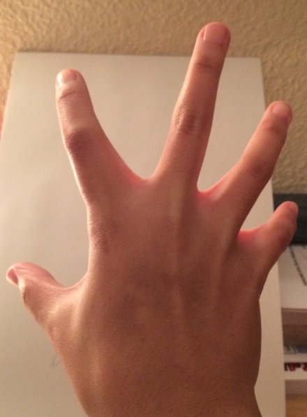 For this: My friends' face LOL XDD *smack* dw it was all a joke, good laugh too lmaoo 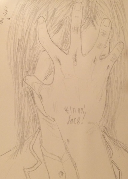 |
xGelaiFeb 14, 2015 11:17 AM
|
Feb 14, 2015 1:36 PM
#9
| I did finish it :( it was a picture of a girl that I drew and that;s how the picture looked Here is the pic  |
| They said "There is no santa clause" I simply asked them "If santa clause isn't real then are you?" After that the voices in my head stopped speaking to me |
Feb 14, 2015 2:34 PM
#10

sorry but picture taken from cell phone here is one. and second  |
Howizter98Feb 14, 2015 2:37 PM
 |
Feb 14, 2015 2:35 PM
#11
| Oh!! Sorry I never noticed >.<! I actually didn't mind it like that (thought I read unfinished) it looks rlly realistic! |
|
Feb 14, 2015 2:39 PM
#12
| They are unfinished :/ I got this problem with the sky DX |
|
Feb 14, 2015 5:33 PM
#14
Here's something I started just so that I could have something to post hahaha. Got kinda sloppy towards the end. 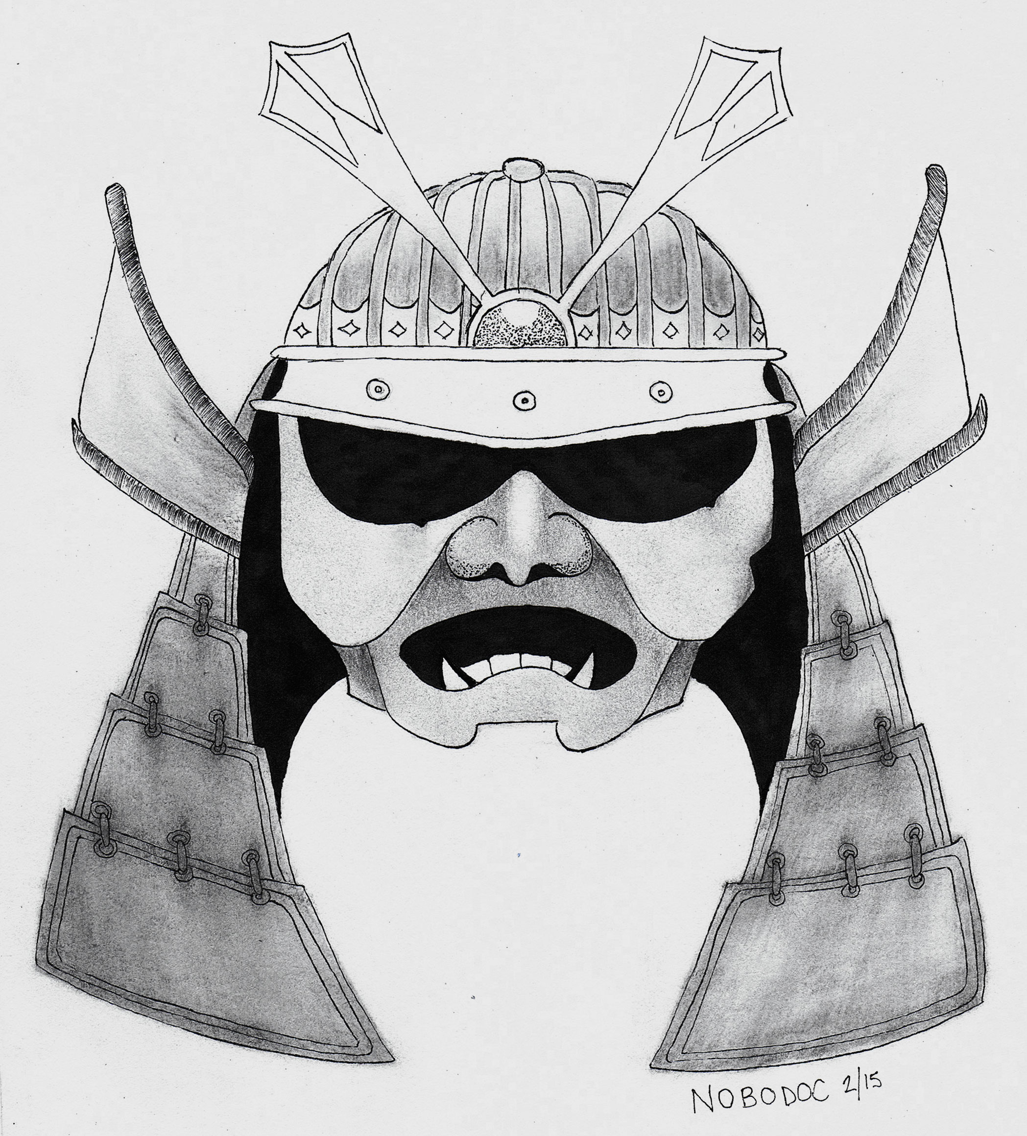 |
 |
Feb 14, 2015 5:56 PM
#15
LMDY said: I displayed the girl on the other thread but I actually do want a critique on it OP, I like the drawing in its overall-ness. I do however feel that it would be nice to have a bit more toning to the skin of the subject. I understand you're drawing using a photo reference, yet I feel that perhaps you could add a few more elements to the composition so that it would maybe contrast or accentuate the presence of the main subject. The hair was done quite nicely and I really enjoy the enigmatically charming look of the subject's face. Great illustration OP :) |
|
Feb 14, 2015 8:00 PM
#16
nobodoc said: Do you mind showing me some examples? thank you for the critique and the complement by the way. I am quite new to art so I don't really understand most of what you are telling me to change so if you can put this is laymen terms I would really appreciate it.LMDY said: I displayed the girl on the other thread but I actually do want a critique on it OP, I like the drawing in its overall-ness. I do however feel that it would be nice to have a bit more toning to the skin of the subject. I understand you're drawing using a photo reference, yet I feel that perhaps you could add a few more elements to the composition so that it would maybe contrast or accentuate the presence of the main subject. The hair was done quite nicely and I really enjoy the enigmatically charming look of the subject's face. Great illustration OP :) |
| They said "There is no santa clause" I simply asked them "If santa clause isn't real then are you?" After that the voices in my head stopped speaking to me |
Feb 15, 2015 3:39 AM
#17
LMDY said: nobodoc said: Do you mind showing me some examples? thank you for the critique and the complement by the way. I am quite new to art so I don't really understand most of what you are telling me to change so if you can put this is laymen terms I would really appreciate it.LMDY said: I displayed the girl on the other thread but I actually do want a critique on it OP, I like the drawing in its overall-ness. I do however feel that it would be nice to have a bit more toning to the skin of the subject. I understand you're drawing using a photo reference, yet I feel that perhaps you could add a few more elements to the composition so that it would maybe contrast or accentuate the presence of the main subject. The hair was done quite nicely and I really enjoy the enigmatically charming look of the subject's face. Great illustration OP :) I wouldn't have any personal examples of mine to show tbh. I was never good at drawing itself in school, my strongpoint was always writing essays in art class. -By toning I mean more use of your pencil so that you give more depth to the subject. As of now, although not a downside, the subject's face appears three-dimensionally flat. By shading or toning the skin with graphite you're able to push certain areas back and bring other areas forward (just like in a real person's face i.e. our eye sockets lie deeper into our faces and our cheeks and nose kind of protrude more). So maybe by hatching (shading technique) close or around the receding hairline it would give the impression that the end of the forehead is pushed back into the drawing which in turn pushes the area of the brow forward. -In terms of composition or what makes up your drawing, I guess it's fine as is since you're using a photo as a reference. When I mentioned adding a few more elements to it, they could be anything really. Perhaps you decide to lightly outline the environment that is around the subject (e.g. her room, bookshelves, bed, table..). This is of course a real minor recommendation but it always makes the composition a bit more interesting as a whole given you have the time, effort and interest to go as far, which is often not the case for everyone. Well, hope this helped man. If you have the time, I'd be interested in what you have to say about my samurai sketch. Take care. |
|
Feb 15, 2015 7:27 AM
#18
nobodoc said: [/quote]LMDY said: nobodoc said: LMDY said: I displayed the girl on the other thread but I actually do want a critique on it OP, I like the drawing in its overall-ness. I do however feel that it would be nice to have a bit more toning to the skin of the subject. I understand you're drawing using a photo reference, yet I feel that perhaps you could add a few more elements to the composition so that it would maybe contrast or accentuate the presence of the main subject. The hair was done quite nicely and I really enjoy the enigmatically charming look of the subject's face. Great illustration OP :) I wouldn't have any personal examples of mine to show tbh. I was never good at drawing itself in school, my strongpoint was always writing essays in art class. -By toning I mean more use of your pencil so that you give more depth to the subject. As of now, although not a downside, the subject's face appears three-dimensionally flat. By shading or toning the skin with graphite you're able to push certain areas back and bring other areas forward (just like in a real person's face i.e. our eye sockets lie deeper into our faces and our cheeks and nose kind of protrude more). So maybe by hatching (shading technique) close or around the receding hairline it would give the impression that the end of the forehead is pushed back into the drawing which in turn pushes the area of the brow forward. -In terms of composition or what makes up your drawing, I guess it's fine as is since you're using a photo as a reference. When I mentioned adding a few more elements to it, they could be anything really. Perhaps you decide to lightly outline the environment that is around the subject (e.g. her room, bookshelves, bed, table..). This is of course a real minor recommendation but it always makes the composition a bit more interesting as a whole given you have the time, effort and interest to go as far, which is often not the case for everyone. Well, hope this helped man. If you have the time, I'd be interested in what you have to say about my samurai sketch. Take care. To be honest I'm not good at critiquing but I do have a question, what did you use for shadowing? Also thanks for the advice I will try the first one and see how it comes out (I also thought it was a bit flat but I drew it the way I saw so I didn't know what else to add.) |
| They said "There is no santa clause" I simply asked them "If santa clause isn't real then are you?" After that the voices in my head stopped speaking to me |
Feb 15, 2015 8:25 AM
#19
LMDY said: [/spoiler][spoiler] nobodoc said: LMDY said: nobodoc said: Do you mind showing me some examples? thank you for the critique and the complement by the way. I am quite new to art so I don't really understand most of what you are telling me to change so if you can put this is laymen terms I would really appreciate it.LMDY said: I displayed the girl on the other thread but I actually do want a critique on it OP, I like the drawing in its overall-ness. I do however feel that it would be nice to have a bit more toning to the skin of the subject. I understand you're drawing using a photo reference, yet I feel that perhaps you could add a few more elements to the composition so that it would maybe contrast or accentuate the presence of the main subject. The hair was done quite nicely and I really enjoy the enigmatically charming look of the subject's face. Great illustration OP :) I wouldn't have any personal examples of mine to show tbh. I was never good at drawing itself in school, my strongpoint was always writing essays in art class. -By toning I mean more use of your pencil so that you give more depth to the subject. As of now, although not a downside, the subject's face appears three-dimensionally flat. By shading or toning the skin with graphite you're able to push certain areas back and bring other areas forward (just like in a real person's face i.e. our eye sockets lie deeper into our faces and our cheeks and nose kind of protrude more). So maybe by hatching (shading technique) close or around the receding hairline it would give the impression that the end of the forehead is pushed back into the drawing which in turn pushes the area of the brow forward. -In terms of composition or what makes up your drawing, I guess it's fine as is since you're using a photo as a reference. When I mentioned adding a few more elements to it, they could be anything really. Perhaps you decide to lightly outline the environment that is around the subject (e.g. her room, bookshelves, bed, table..). This is of course a real minor recommendation but it always makes the composition a bit more interesting as a whole given you have the time, effort and interest to go as far, which is often not the case for everyone. Well, hope this helped man. If you have the time, I'd be interested in what you have to say about my samurai sketch. Take care. To be honest I'm not good at critiquing but I do have a question, what did you use for shadowing? Also thanks for the advice I will try the first one and see how it comes out (I also thought it was a bit flat but I drew it the way I saw so I didn't know what else to add.)[/quote][/quote] I used mostly 2B, 4B, and 6B pencils. To blend it all (and a poor job at that) I used both my fingers and a make-up sponge. |
|
Feb 15, 2015 8:53 AM
#20
| What's 2b 4b and 6b pencils. I thought people only used regular pencils and a blending tool. Do the 2/4/6B have something to do with the thickness of the graphite within the pencil? If it does then someone told me about this before but my applied art teacher doesn't have them so i couldn't use them |
| They said "There is no santa clause" I simply asked them "If santa clause isn't real then are you?" After that the voices in my head stopped speaking to me |
Feb 15, 2015 9:37 AM
#21
LMDY said: What's 2b 4b and 6b pencils. I thought people only used regular pencils and a blending tool. Do the 2/4/6B have something to do with the thickness of the graphite within the pencil? If it does then someone told me about this before but my applied art teacher doesn't have them so i couldn't use them The pencil's rating (i.e. 3H, H, HB, 2B, 4B, 6B...) actually refers to the hardness of the lead. The softer the lead (e.g. 8B) the less you have to apply pressure to gain darker tones. Harder leads (e.g. 6H) will require more pressure to gain even slightly darker tones. Overall, softer leads found in pencils such as 8B will give darker tones, whereas harder leads such as 6H (in the opposite side of the spectrum) will comparatively give much lighter tones. Here's a link to give you an idea: http://i00.i.aliimg.com/wsphoto/v0/1600478520_1/-font-b-STAEDTLER-b-font-Professional-drawing-font-b-pencil-b-font-6-pcs-font.jpg |
|
Feb 15, 2015 9:41 AM
#22
nobodoc said: I'm actually going to keep that as a reference and buy some of those magical pencilsLMDY said: What's 2b 4b and 6b pencils. I thought people only used regular pencils and a blending tool. Do the 2/4/6B have something to do with the thickness of the graphite within the pencil? If it does then someone told me about this before but my applied art teacher doesn't have them so i couldn't use them The pencil's rating (i.e. 3H, H, HB, 2B, 4B, 6B...) actually refers to the hardness of the lead. The softer the lead (e.g. 8B) the less you have to apply pressure to gain darker tones. Harder leads (e.g. 6H) will require more pressure to gain even slightly darker tones. Overall, softer leads found in pencils such as 8B will give darker tones, whereas harder leads such as 6H (in the opposite side of the spectrum) will comparatively give much lighter tones. Here's a link to give you an idea: http://i00.i.aliimg.com/wsphoto/v0/1600478520_1/-font-b-STAEDTLER-b-font-Professional-drawing-font-b-pencil-b-font-6-pcs-font.jpg |
| They said "There is no santa clause" I simply asked them "If santa clause isn't real then are you?" After that the voices in my head stopped speaking to me |
Feb 15, 2015 9:53 AM
#23
[quote=LMDY] nobodoc said: LMDY said: What's 2b 4b and 6b pencils. I thought people only used regular pencils and a blending tool. Do the 2/4/6B have something to do with the thickness of the graphite within the pencil? If it does then someone told me about this before but my applied art teacher doesn't have them so i couldn't use them The pencil's rating (i.e. 3H, H, HB, 2B, 4B, 6B...) actually refers to the hardness of the lead. The softer the lead (e.g. 8B) the less you have to apply pressure to gain darker tones. Harder leads (e.g. 6H) will require more pressure to gain even slightly darker tones. Overall, softer leads found in pencils such as 8B will give darker tones, whereas harder leads such as 6H (in the opposite side of the spectrum) will comparatively give much lighter tones. Here's a link to give you an idea: http://i00.i.aliimg.com/wsphoto/v0/1600478520_1/-font-b-STAEDTLER-b-font-Professional-drawing-font-b-pencil-b-font-6-pcs-font.jpg Hahahahaha, they make a bunch but I guess you only need about 3 of them really for basic work. |
|
Feb 15, 2015 9:55 AM
#24
nobodoc said: [quote=LMDY] nobodoc said: LMDY said: What's 2b 4b and 6b pencils. I thought people only used regular pencils and a blending tool. Do the 2/4/6B have something to do with the thickness of the graphite within the pencil? If it does then someone told me about this before but my applied art teacher doesn't have them so i couldn't use them The pencil's rating (i.e. 3H, H, HB, 2B, 4B, 6B...) actually refers to the hardness of the lead. The softer the lead (e.g. 8B) the less you have to apply pressure to gain darker tones. Harder leads (e.g. 6H) will require more pressure to gain even slightly darker tones. Overall, softer leads found in pencils such as 8B will give darker tones, whereas harder leads such as 6H (in the opposite side of the spectrum) will comparatively give much lighter tones. Here's a link to give you an idea: http://i00.i.aliimg.com/wsphoto/v0/1600478520_1/-font-b-STAEDTLER-b-font-Professional-drawing-font-b-pencil-b-font-6-pcs-font.jpg Hahahahaha, they make a bunch but I guess you only need about 3 of them really for basic work.[/quote] |
| They said "There is no santa clause" I simply asked them "If santa clause isn't real then are you?" After that the voices in my head stopped speaking to me |
Feb 15, 2015 11:26 AM
#25
LMDY said: [spoiler] nobodoc said: [quote=LMDY] nobodoc said: LMDY said: What's 2b 4b and 6b pencils. I thought people only used regular pencils and a blending tool. Do the 2/4/6B have something to do with the thickness of the graphite within the pencil? If it does then someone told me about this before but my applied art teacher doesn't have them so i couldn't use them The pencil's rating (i.e. 3H, H, HB, 2B, 4B, 6B...) actually refers to the hardness of the lead. The softer the lead (e.g. 8B) the less you have to apply pressure to gain darker tones. Harder leads (e.g. 6H) will require more pressure to gain even slightly darker tones. Overall, softer leads found in pencils such as 8B will give darker tones, whereas harder leads such as 6H (in the opposite side of the spectrum) will comparatively give much lighter tones. Here's a link to give you an idea: http://i00.i.aliimg.com/wsphoto/v0/1600478520_1/-font-b-STAEDTLER-b-font-Professional-drawing-font-b-pencil-b-font-6-pcs-font.jpg Hahahahaha, they make a bunch but I guess you only need about 3 of them really for basic work. Likewise |
|
Feb 15, 2015 11:43 AM
#26
nobodoc said: [/spoiler]LMDY said: [spoiler] nobodoc said: [quote=LMDY] nobodoc said: LMDY said: What's 2b 4b and 6b pencils. I thought people only used regular pencils and a blending tool. Do the 2/4/6B have something to do with the thickness of the graphite within the pencil? If it does then someone told me about this before but my applied art teacher doesn't have them so i couldn't use them The pencil's rating (i.e. 3H, H, HB, 2B, 4B, 6B...) actually refers to the hardness of the lead. The softer the lead (e.g. 8B) the less you have to apply pressure to gain darker tones. Harder leads (e.g. 6H) will require more pressure to gain even slightly darker tones. Overall, softer leads found in pencils such as 8B will give darker tones, whereas harder leads such as 6H (in the opposite side of the spectrum) will comparatively give much lighter tones. Here's a link to give you an idea: http://i00.i.aliimg.com/wsphoto/v0/1600478520_1/-font-b-STAEDTLER-b-font-Professional-drawing-font-b-pencil-b-font-6-pcs-font.jpg Hahahahaha, they make a bunch but I guess you only need about 3 of them really for basic work. Likewise[/quote]I will try but I don't think I will be able to give you a good critique since I suck at it but I will try. |
| They said "There is no santa clause" I simply asked them "If santa clause isn't real then are you?" After that the voices in my head stopped speaking to me |
Feb 15, 2015 12:03 PM
#27
| So many spoilers to quotations~! 'Magical pencils' XDDD |
|
Feb 15, 2015 12:04 PM
#28
| They are magical though xD |
| They said "There is no santa clause" I simply asked them "If santa clause isn't real then are you?" After that the voices in my head stopped speaking to me |
Feb 15, 2015 12:13 PM
#29
| Truee (tbh I don't even use all of them :F) ~Magical safe keeping~ |
|
Feb 15, 2015 1:06 PM
#30
xGelai said: Truee (tbh I don't even use all of them :F) ~Magical safe keeping~ I was so tempted to buy the full range from Staedler the other week hahaha, it comes in such a nice box |
|
Feb 15, 2015 1:45 PM
#31
Feb 15, 2015 1:57 PM
#32
xGelai said: @Nobodoc, Oh I've got the full range but I usually just use the HB pencils. I've got loads~~ Do you use the other ranges? The only ones I use now are the HB to 8B from Staedler; it's a recent purchase and before that I was just straight up using Micron pens non-stop haha |
|
Feb 18, 2015 7:15 AM
#34

| Yo guys. I'm practicing on proportion. Please gimme advice! [I have a personal mindset that advice makes you better but critique makes you worse :P] [center][spoiler]  [center][spoiler] |
Feb 18, 2015 7:32 AM
#35
| I'm not a big fan of drawing people so I'm not too familiar with body proportions. Other than the fact that the body looks proportionate and it's a decent drawing I couldn't give you good advice. If I were to venture into giving you my opinion however, I would perhaps advise to make the thickness of the chest in side profile slightly thinner because with such size I would expect broader shoulders in the mannequin's front profile. The opposite could also be done: broadening the shoulders to make the thickness of the chest more natural. |
|
Feb 18, 2015 3:23 PM
#36
kazu00 said: Yo guys. I'm practicing on proportion. Please gimme advice! [I have a personal mindset that advice makes you better but critique makes you worse :P] [center][spoiler] [center][spoiler] I feel the legs are a bit short, but don't worry, it depends of the style as well. I would recommend you to practice proportions where they really are tricky, which is in action scenes, action doesn't mean a fight, I mean doing something, anything, walking, eating sat on a chair. and stuff like that. Also, work on the feet and open hands, don't avoid them just because you are not good at them, they are really difficult to master, I still have some problems with them. |
Feb 18, 2015 3:48 PM
#37
nobodoc said: I'm not a big fan of drawing people so I'm not too familiar with body proportions. Other than the fact that the body looks proportionate and it's a decent drawing I couldn't give you good advice. If I were to venture into giving you my opinion however, I would perhaps advise to make the thickness of the chest in side profile slightly thinner because with such size I would expect broader shoulders in the mannequin's front profile. The opposite could also be done: broadening the shoulders to make the thickness of the chest more natural. Yeah if I'm not careful I might ended up giving him boobs. Thanks! YamamotoSensei said: kazu00 said: Yo guys. I'm practicing on proportion. Please gimme advice! [I have a personal mindset that advice makes you better but critique makes you worse :P] [center] [center] I feel the legs are a bit short, but don't worry, it depends of the style as well. I would recommend you to practice proportions where they really are tricky, which is in action scenes, action doesn't mean a fight, I mean doing something, anything, walking, eating sat on a chair. and stuff like that. Also, work on the feet and open hands, don't avoid them just because you are not good at them, they are really difficult to master, I still have some problems with them. Gotcha! I hate drawing the lower body. So weak at feet. I only hid one hand bcs I didn't know what position that should be drawn lmao. Thank you for the advice and encouragement. |
Feb 18, 2015 3:52 PM
#38
| @Kazu00, the hands should be the same size as the face, not the head, just the face, from the fringe to the chin. And the feet, the same size as the whole head. |
Feb 18, 2015 8:20 PM
#39
| Can one of you guys teach me the basic proportions of a anime female and male? I watched some youtube videos on it but none of them really work for me so how do you guys set up your guidelines and outline for your creations? |
| They said "There is no santa clause" I simply asked them "If santa clause isn't real then are you?" After that the voices in my head stopped speaking to me |
Feb 22, 2015 4:12 PM
#40
Girl proportion comin through~~ Advice welcome! YamamotoSensei said: @Kazu00, the hands should be the same size as the face, not the head, just the face, from the fringe to the chin. And the feet, the same size as the whole head. Thanks bro. LMDY said: Can one of you guys teach me the basic proportions of a anime female and male? I watched some youtube videos on it but none of them really work for me so how do you guys set up your guidelines and outline for your creations? I wish I could. Not enough skill to teach someone. |
Feb 22, 2015 9:47 PM
#41

| To be honest, I see nothing wrong with it!! It's simply amazing!! (Though I'm not really an expert on proportions) I think the area where the clavicle appears to be is a little too far from her back on her side profile? (Again I'm no expert, so don't take this too seriously unless someone agrees!) Then again, she might be wearing a lot of thick clothing underneath.. but yeah! |
  |
Feb 23, 2015 1:37 PM
#42
Jaymusta said: To be honest, I see nothing wrong with it!! It's simply amazing!! (Though I'm not really an expert on proportions) I think the area where the clavicle appears to be is a little too far from her back on her side profile? (Again I'm no expert, so don't take this too seriously unless someone agrees!) Then again, she might be wearing a lot of thick clothing underneath.. but yeah! Hahaha its okay just say what you think is needed to be improved! You mean she looks fat? lol ok thanks! So sad the display & critique threads are so quiet. |
Feb 23, 2015 2:42 PM
#43
| You seem like a pro mangaka since it looks like the real manga art styles!! It looks rlly nice *^*, your really good at this proportional thing Kazu!! I think it looks pretty natural since the clothes.. I just spotted this but who's 'Mabel' =3?. |
|
Feb 23, 2015 7:13 PM
#44
kazu00 said: Jaymusta said: To be honest, I see nothing wrong with it!! It's simply amazing!! (Though I'm not really an expert on proportions) I think the area where the clavicle appears to be is a little too far from her back on her side profile? (Again I'm no expert, so don't take this too seriously unless someone agrees!) Then again, she might be wearing a lot of thick clothing underneath.. but yeah! Hahaha its okay just say what you think is needed to be improved! You mean she looks fat? lol ok thanks! So sad the display & critique threads are so quiet. I didn't mean she looked fat!! X.X |
| |
Feb 23, 2015 7:35 PM
#45
xGelai said: You seem like a pro mangaka since it looks like the real manga art styles!! It looks rlly nice *^*, your really good at this proportional thing Kazu!! I think it looks pretty natural since the clothes.. I just spotted this but who's 'Mabel' =3?. LOL NO!! Me a puro?.. Someday! Yeah I should have made her wearing tight clothes to see what's unnatural. Maa bad. Do you still remember An-chan? She poisoned me with Gravity Falls series. It's a cartoon that I just turned her into anime form. xD @Jaymusta Hahaha ok. :P |
Feb 23, 2015 8:31 PM
#46
kazu00 said: xGelai said: You seem like a pro mangaka since it looks like the real manga art styles!! It looks rlly nice *^*, your really good at this proportional thing Kazu!! I think it looks pretty natural since the clothes.. I just spotted this but who's 'Mabel' =3?. LOL NO!! Me a puro?.. Someday! Yeah I should have made her wearing tight clothes to see what's unnatural. Maa bad. Do you still remember An-chan? She poisoned me with Gravity Falls series. It's a cartoon that I just turned her into anime form. xD @Jaymusta Hahaha ok. :P Oh. My. Gawd. I see it now!!! |
| |
Feb 24, 2015 8:04 AM
#47
| Yeahhh I see it now too XDD. Wow your amazing Kazuu!! |
|
Apr 22, 2015 12:53 AM
#48

plz ignore others just check the first one. the shorts seem off?? so i chopped his face too ...  |
 mitsumi ❤ iwakura ✧ deliveries ✧ awc ✦ mrc ✧ set by titanween ✧ |
Apr 22, 2015 4:15 AM
#49
mshehana said: plz ignore others just check the first one. the shorts seem off?? so i chopped his face too ... feedback I really like the unconventional shading effects! The four characters gave me the creeps. I love it Are these character designs for a novel? a webcomic? I think you can pull off a pretty creepy horror series with these guys. Especially the second (girl?) from the left! Mouthless and a broken right foot, I love it! Potential improvements, I think these characters could use a little more fluff. somethings you don't immediately notice but once you see it you can't ever unsee Things like suicide scars on characters' wrists that can be easily put off as just a style of drawing. have the bear on the right from black stockings be missing a left eye. Stuff like that! to answer your question: [spoiler] They look fine! |
BobulatedApr 22, 2015 4:33 AM
| I've quit MAL email me at instead. muyaobobwu@gmail.com |
Apr 22, 2015 1:28 PM
#50
| Bob-kun... >_<" @Hana, its Kenna right? From Haikyuu!! All 4 = Same person.? Hmm.. His shorts looks fine. Shading is done really well too. Looks a bit flat towards the zip part but not sure how to expand on that.. Tho thats just me(?). Seems difficult to imagine how that shading would be so unsure for that part. Nah, I think @-@ its fine, the shading shows enough. Plus including that wouldve been subtle.. Looks rlly nice btw!! |
|
More topics from this board
» Introductions✪ ( 1 2 3 4 )UglySlime - Feb 13, 2015 |
157 |
by RokuOEK
»»
Jun 1, 2016 7:12 PM |
|
Sticky: » Display Art✪ ( 1 2 3 4 )UglySlime - Feb 13, 2015 |
152 |
by kuro_biker
»»
May 23, 2016 4:42 PM |
|
» EZDEATHS ART HERE check it outezlord - May 19, 2015 |
0 |
by ezlord
»»
May 19, 2015 7:58 PM |
|
» Colouring stuff and equipment!Rayaxe - May 11, 2015 |
1 |
by Rayaxe
»»
May 16, 2015 2:26 PM |
|
» Art Challenge: Glass ContainerZurel - Apr 26, 2015 |
14 |
by Zurel
»»
May 6, 2015 10:27 AM |