Feb 27, 2017
Rate of 2 (dreadful)
no vocals
Story
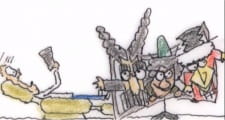
there was none. You just have a film strip of small animation clips. The animations are not carried on but change completely from strip to strip. It was designed as comedy but there was nothing funny except how bad the portray was.
Art
An absolute eye sore. You need a magnifying glass for at least 1 third of the movie. For the director whatever reason decided i will do a complete zoom out of the small strips of animations then slowly zoom in. Interesting idea in theory but how it worked out is the opposite. How can you expect the audience to watch
...
your film if they cant see it clearly. Let me describe his nasty process. With the video set for full screen the video starts as one inch big. Then shortly turns into 2inches before finally getting to full screen for about 10 or seconds. before repeating the process with a different clip. Why could the animation not just be full-screened to begin with? Were there thoughts on the white portions of the strips that came to mind as you drew the sketches only to suffer from invisible ink? In short there was no purpose for that action. To make matters worse it is clear the person filming as seen in the intro and conclusion can't afford or does not know what a tripod is.
Sound
There was no sound effects. Just pointless music that continued and changed after 3 or so different slide animations. The music could have been nicer if had made sense to the art or if was at an appropriate level.
Character -NONE!
Enjoyment: Best to see as a beginner guide to the art of filming as a student. Nothing more.
Reviewer’s Rating: 2
What did you think of this review?
Nice
 0
0
Love it
 0
0
Funny
 0
0
Confusing
 0
0
Well-written
 0
0
Creative
 0
0Show all


